As mentioned in my previous post, I have a deep love for music and as such I am happy to write about another musical website which I had the pleasure of working on. The client this time was Evans Custom Amplifiers (www.evansamps.com); a company well known for making great amplifiers for both steel guitar, jazz, and just about anything that requires really pristine clean sound quality. I had first listened to their amplifiers a few years ago while watching a live show, and so recently I decided to contact them and found their website did not feel of nearly the same great quality that their products possess. With that said, I contacted Scot Buffington, to whom I explained what I could do to improve their website, and with it the impression the website can make in the web.
Their old website was fully functional and did the job, but there were many things asking to be updated and improved. Amongst these things to improve were a better unique design style, brand identity, modern standard practices, improved navigation, and content management features to allow them to maintain the website with ease should they ever want to change the content of a page for example.
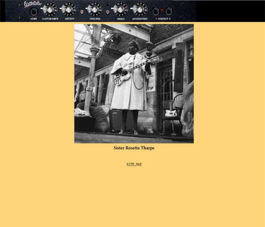
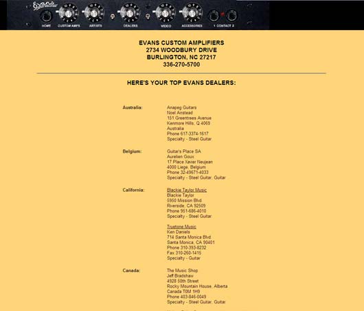
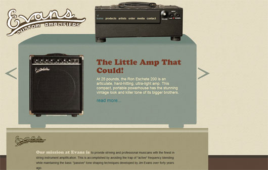
In order to explain the strategies for the design I have included some screenshots of the original design. As you can see in the pictures above, their old design is simple, and has an interesting menu, however, it lacks a good framework to place emphasis on the various elements throughout the website, especially their logo. Their logo is very small, and its actually a really nice logo worth displaying. The kerning and tracking is not exactly even, but it is perhaps that which gives it that recognizable natural appearance. Long story short, that logo deserves to stand out, so that we can try to record it in everyone’s mind. Like the logo, the menu also lacked clarity. Their original menu was very creative which I liked, but could benefit from more clarity in both the resolution of the images, and visual contrast, furthermore could be found confusing to some. With that said, I simplified it the menu while still keeping the context of “amplifier website.” In all of my mockups I made sure to tie the entire design to amplifiers, so people can tell what the website is about in a single view.
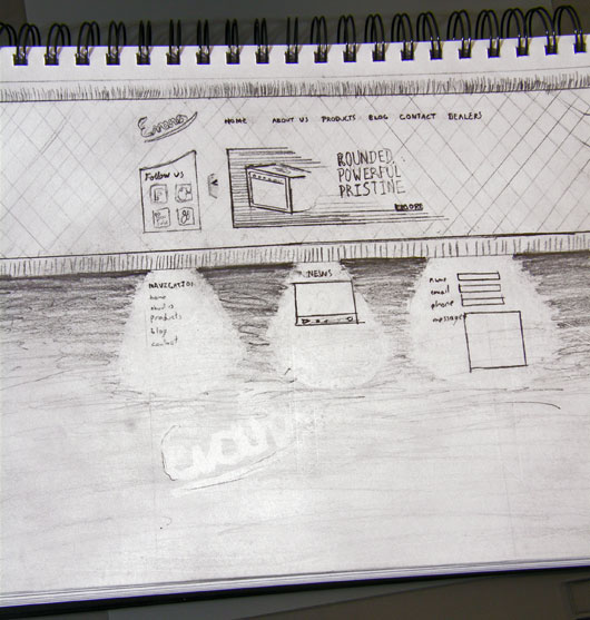
As you can see in the mockups below, there is more emphasis on the products, and the logos stand out more cleanly. Before making mockups however, it is always useful to make a rough map in pencil. Using a pencil allows me to be more free with my ideas, rather than limiting myself to the predefined tools in the computer. The idea is always first.
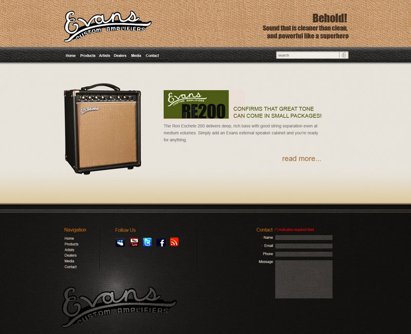
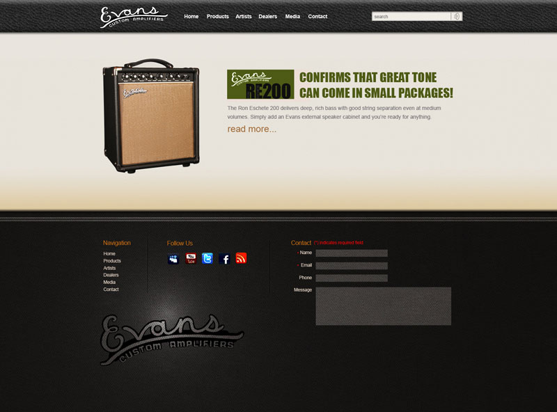
The final version, which is the last image was the one I ended executing as it has the most recognizable appearance which is of great advantage when it comes to brand identity. The look still keeps the vintage warm tones of their amplifier’s sound, and like amplifiers, the layout shares the stacked boxes look of amplification instruments giving a stronger visual cue as to what the website is about. In this layout there are lots of textures to tie into the idea that these amps provide that warm organic sound guitarists love so much. I also asked the client for a photoshoot of their products in very specific angles and lighting conditions. Not only do they make great products, but they were great people to work with. They hired a photographer and had the photoshoot follow my specifications, which was crucial to the execution of the concept. I cut these images providing a very consistent feel across the photographs and product pages. The reason behind the specific angles I requested for this photoshoot are so that users can see all the functions the products have to offer without even reading any technical specifications.
In executing this website I decided to use the HTML5 to make it ready for the future browsers, while ensuring functionality, and design are not compromised in older browsers. The entire website is done around the CMSMS content management system allowing the users to edit the titles, images, content, dealers list, order of products and more. I connected everything to make maintenance of the website a breeze. CMSMS is greatly flexible, and I highly recommend it to everyone who wants to make a truly custom website with its “template withing a template” type work flow.
Visit the final website at www.evansamps.com
I look forward to reading your thoughts on the subject


Comments RSS and TrackBack Identifier URI ?
2 responsesDo you want to comment?
Trackbacks