Weddings mark one of the happiest days of the live’s of most people, meanwhile photography, can be used to hold a record of such day in an elegant manner. Assigned to design a layout for a wedding photography company I thought I would keep both things in mind.
It was a photography site after all that I was supposed to design, and so I began to write down the things that are important for the layout. For one, I did some research on the ratios most cameras output. The web page “photo sizes and image ratios” for example, at http://www.frogprints.co.nz/help/ratio.cfm was of huge help for this, as I want my design to look good regardless of what camera takes the image. Different cameras take their images at different ratios, and it makes no sense to design a great design for a photography site, if the images don’t work with it. Something else which I thought necessary for the site was to design the area for image display as big as possible keeping in mind the standard resolution of 1024×768 pixels. I think it makes sense to have the photos take over most of the screen, as it is good photography the clients will be looking for, furthermore, such a bold decision will show the photographer, as one confident in his/her great skills. I for one would have a hard time hiring someone with a lack of confidence, especially if it’s not someone I know as that well be my first and only impression, which now that I think about it, is the reason why blogs are good.
A blog is near necessity nowadays and so it was necessary for me to keep in mind that the design should fit a blog with minor or no adjustments. Blogs allow the web viewers a closer view upon the subject of the site. Most sites I see don’t have a “brand” consistency with their blog, which I thought would be a good thing to have. Not only would it create a greater sense of togetherness, but it would show a much more professional transition between site and blog, emphasizing the brand identity of the photographer. This of course is not just for photography sites, but for just about everything. This makes things a bit more interesting as the design would now need to be able to handle a bold looking photo gallery as well as a clean blog all at once. If one looks around one finds that the layouts for most photo galleries are incredibly different from those of blogs, however no matter the type of site it is always more comfortable to read lots of copy over light backgrounds.
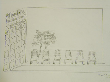
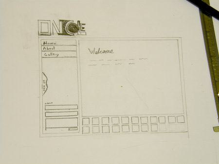
With these clues in mind, I first began sketching on paper some ideas that would allow me emphasize the photos as I desired while keeping the blog text clean. It may seem senseless to sketch on paper to start, but I always have a different mindset when working with paper, which I use as a device for new ideas. My ideas are usually based around more organic less metrically perfect layouts.
Feel free to move your mouse over the following thumnails for a bigger image
These are some of the ideas I came up with sketching on my sketchbook.
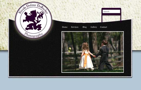
Following those sketches and the idea of warmth and elegance associated with matrimony I created these on the computer with a better idea for the color and structure I would use.
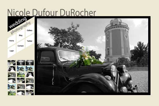
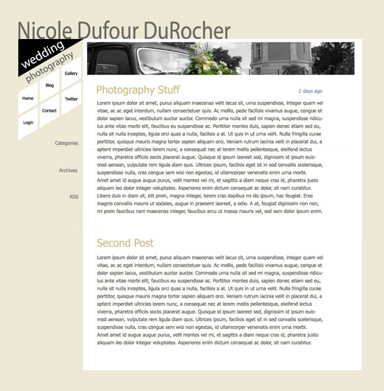
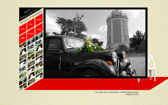
I have decided to go with the tonality of the first digital layout, but with a little bit of a stronger background, as shown in the red layout. The beige tone in the layout with the red accents has much more character


Comments RSS and TrackBack Identifier URI ?
3 responsesDo you want to comment?
Trackbacks