Portfolio
Websites
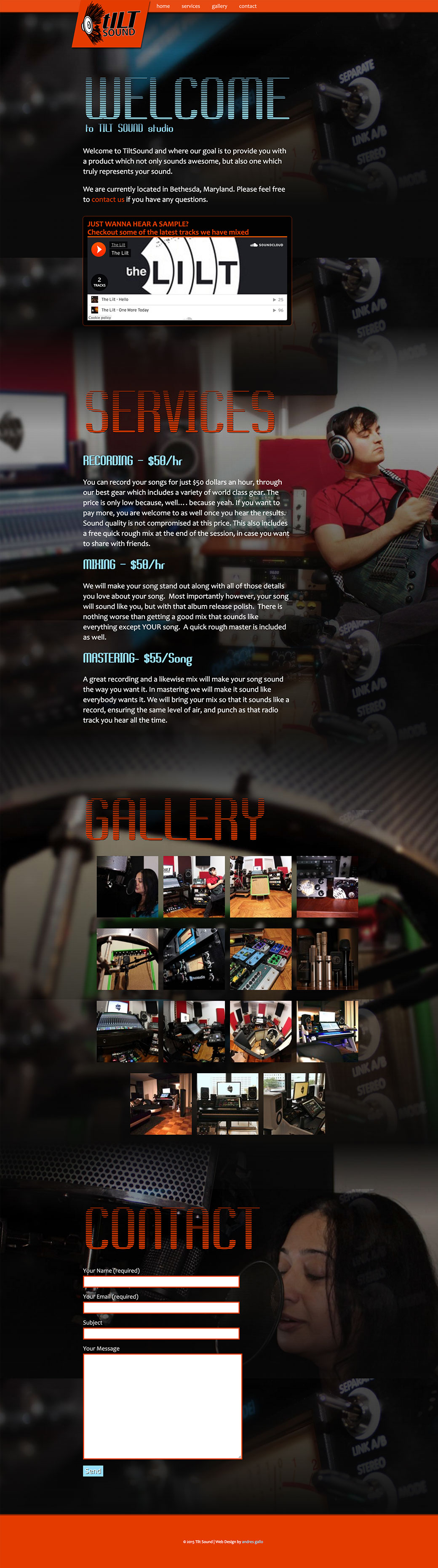
One of my biggest hobbies is music, and audio engineering. In this website, I did the photography, design, and development. I love programming, but it had been a few years since I did any full design work. This site was mainly made to seek fun music projects. It uses some nice CSS techniques here and there. º Visit website…
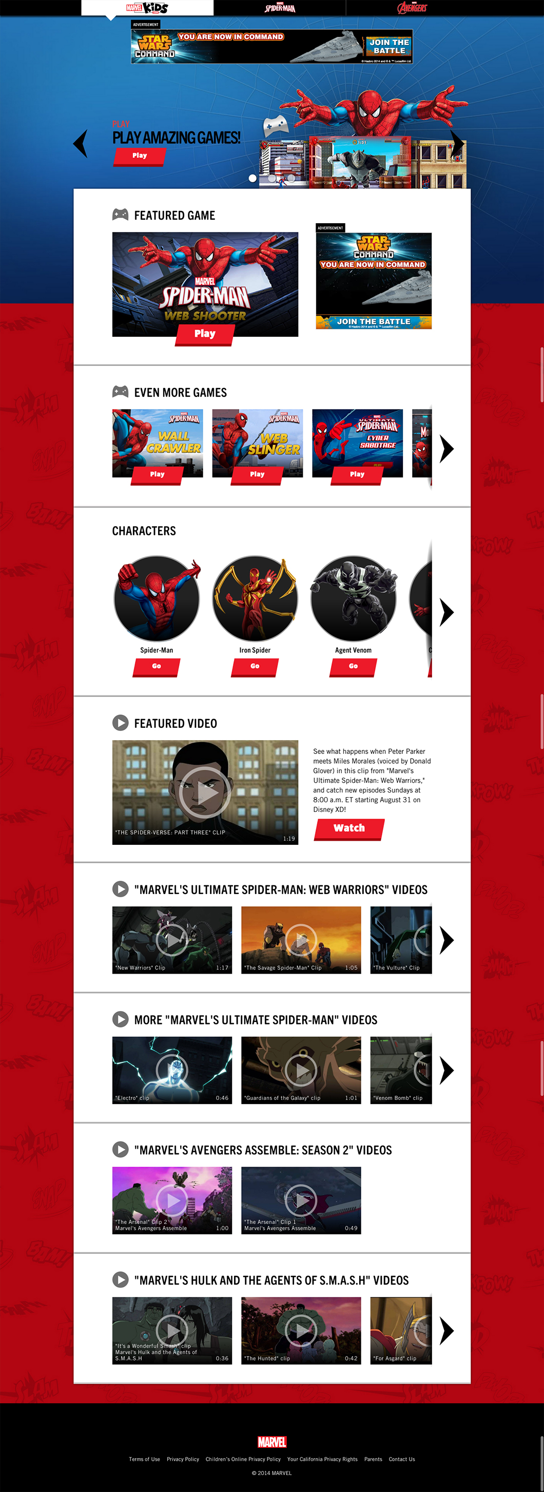
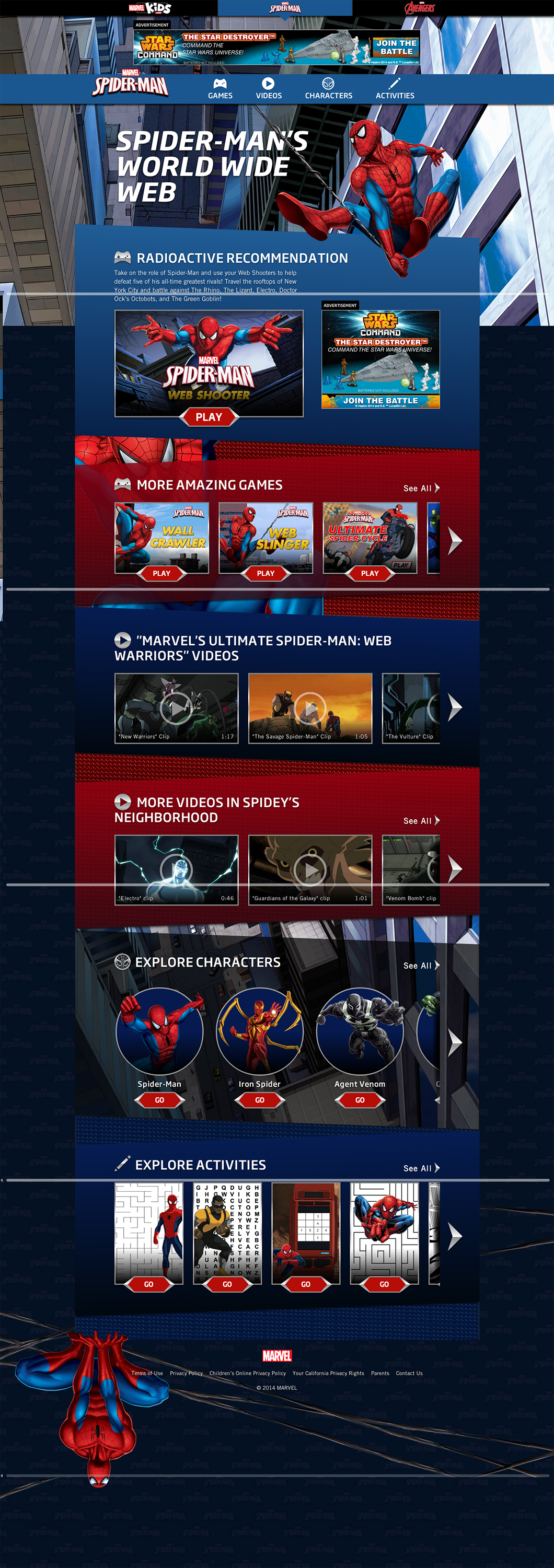
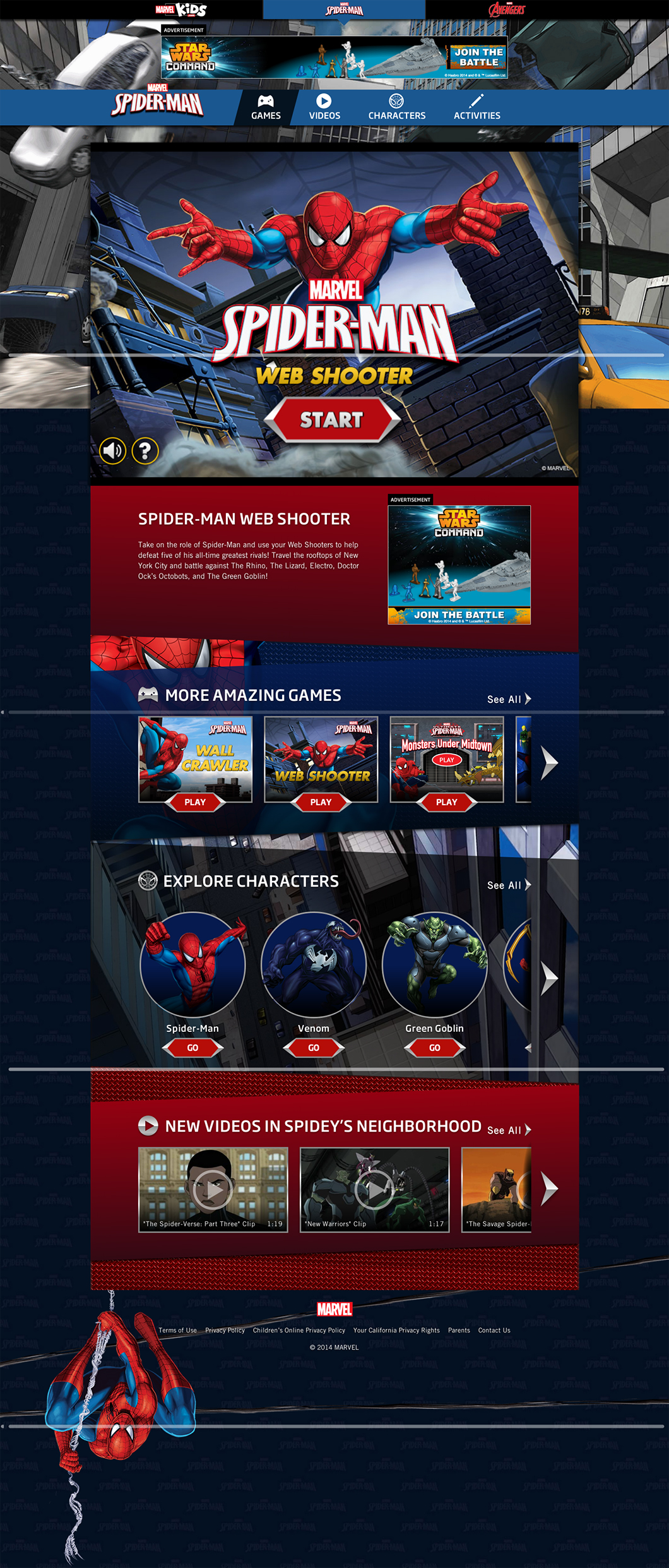
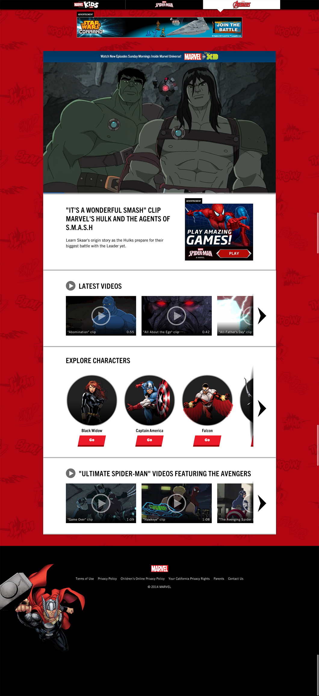
This website was interesting in that it required using a new Ruby backend framework which both provided new features as well as some new limitations as compared to the standard Marvel.com site. This provided a great opportunity for us to reuse a lot of the same components we had previously built while forcing that others be further modularized for easier cross project reuse. º Visit website…
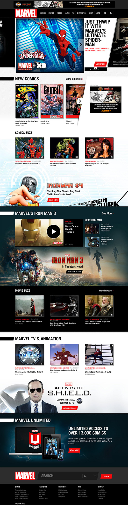
This is one of the most ambitious projects I have ever worked on. With only a small though excellent team we had to build a responsive framework with world class performance and scalability. The result was something cutting edge. For this website, I wrote a variety of modules in extendable patterns to ensure their reuse. Also the Framework is extremely fluid to allow wide support with virtually none of the overhead usually associated with responsive design. It really must be experienced by resizing the window, and in multiple devices to best appreciate the smooth mechanics involved in its implementation. º Visit website…
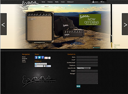
This is my second design for guitar amplifier company Evans Custom Amplifiers. Designing and developing this website was a really interesting challenge. The goal was to make the website completely CMS driven for added scalibility, while keeping the content editing workflow as minimal as possible. This design is built on top of CMSMS, and includes some interesting custom modifications to add to the ease of use, as well as visual flair. º Visit website…
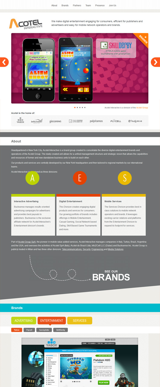
This was a really fun project to work on. I really enjoyed creating efficient patterns to code this website’s layout. For this website efficient patterns were very important considering it has lots of content in a single page. One of these patters/solutions for example is the framework I wrote which allows for ajax content to be brought in based on hash links which can contain parameters. This technique can be seen in the job postings in the website. º Visit website…
This was a very fun project as is the product. This project is about interaction so I wrote various custom widgets to create a highly interactive experience. All the interactions are not only highly visual but use asynchronous request to update information on the server in as seamless a manner as possible. Check it out on both your desktop and mobile. º Visit website…
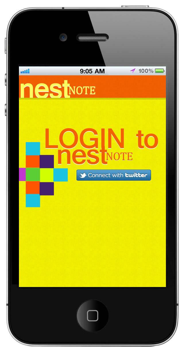
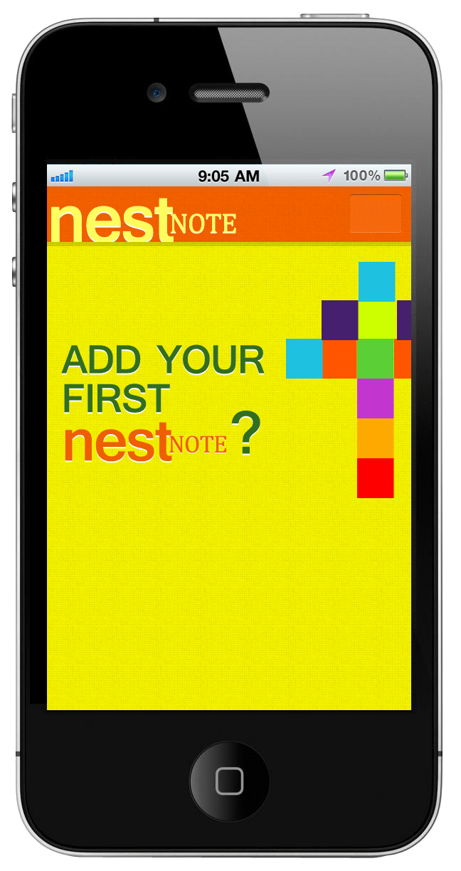
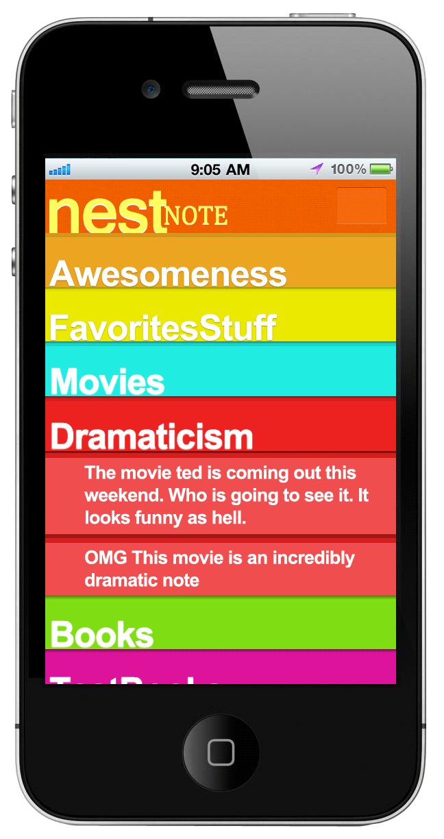
This is an interesting project which was the result of the work of me and one of my friends at a recent Hackathon. Nestnote is interesting for many reasons. The idea is something that can be extended for many uses, and the ui is extremely modern using the capabilities of a touchscreen device. It is, however also interesting as we only had a few hours to put it together during this hackathon, and it works pretty well. To truly appreciate, and enjoy from its UI please try logging into twitter, and writing a tweet to Nestnote such as “This is an awesome note to myself #note #awesome #computers @nestnote.” After this you will have your nestnote organize in the web application where you can further manipulate its category or delete it altogether. I designed and developed the entire UI to be mobile touchscreen friendly once you have notes in your app. On touchscreen mobile devices, you can swipe the notes, and perform actions on them such as moving them to a different category or deleting them much like what you’d expect from a native app. The app is ajax based to be easily wrapped into phonegap.
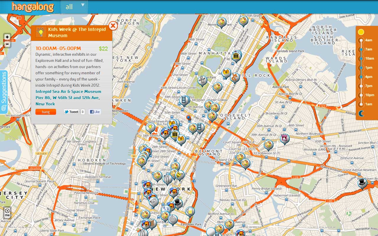
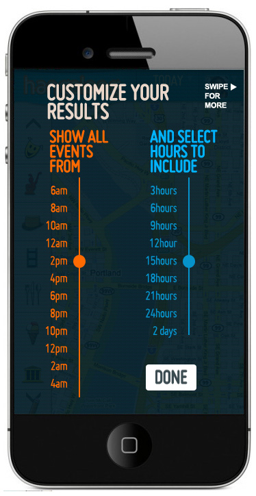
This was an geo based application I built with a friend to allow users to share social events, and even allow users to provide notifications when they have an event near the area. It was a great project and one in which we learned a ton. It was based on Leaflet maps API, and a variety of javascript methods for filtering, notifying and more.
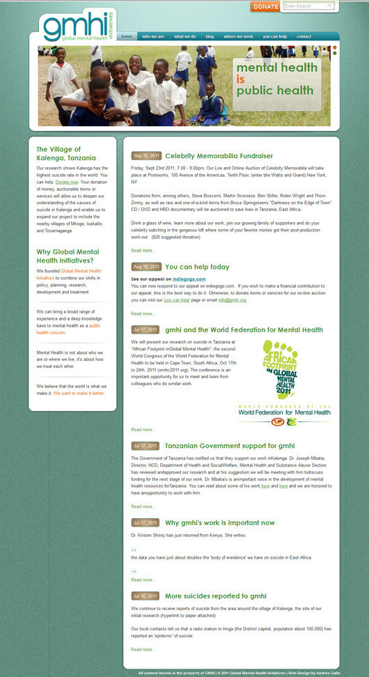
This project was a non-profit donation for an organization doing great work mitigating mental illness in Africa, and soon other places. The design was made to be versatile with text, lists, and more. Its meant to allow users to change content with extreme ease while maintaining professional consistency accross the board.º Read more…
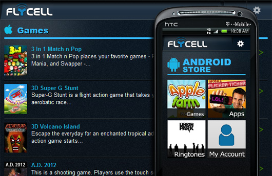
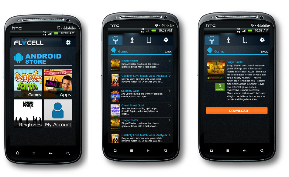
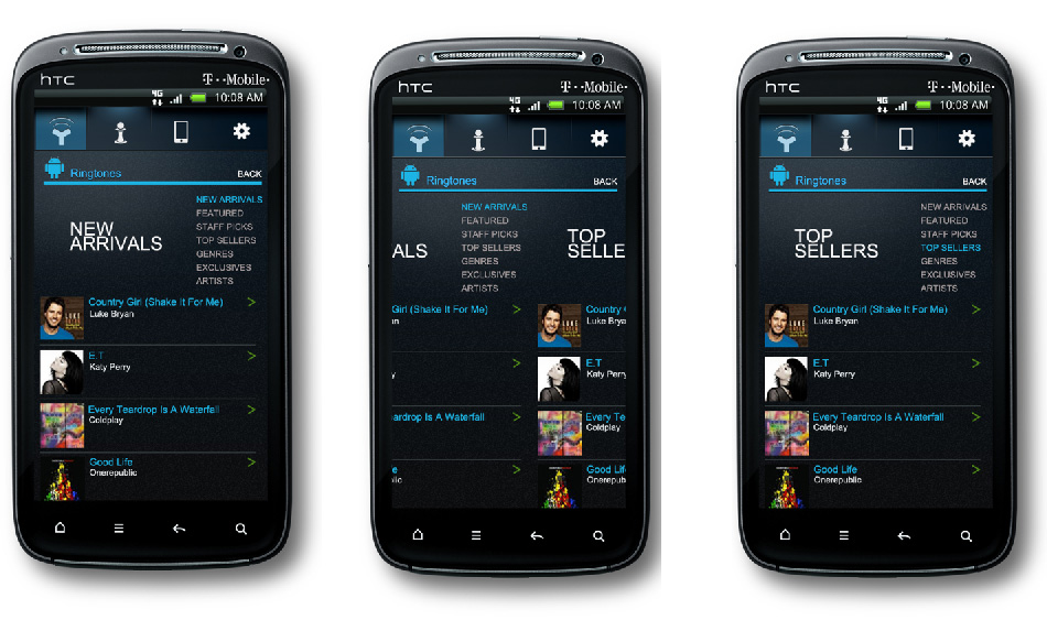
A mobile website for flycell catalog for smartphones. The design was made and built to modernize a pre existing UI flow, but using the capabilities of smartphone’s browsers
The beauty of this project beyond the aesthetics, is that it consists of reading data from a google docs spreadsheet. This makes it easy for just about anyone with the link to the spreadsheet, to update the content. º Read more…
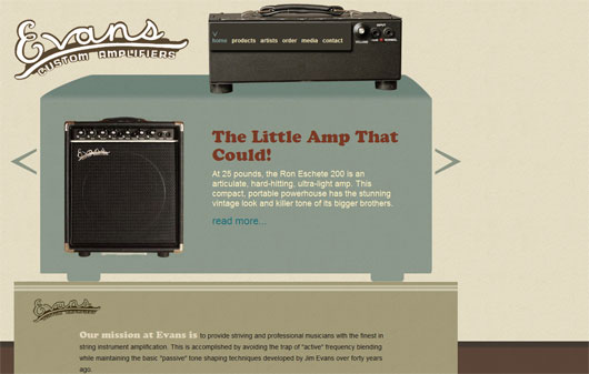
This website was designed and developed using my CMS of choice, CMSMS, for Evans Custom Amplifiers. Its functionality is implemented to make its administration very user friendly. º Read more…
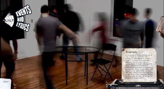
Experimental HTML5 based project for band the lilt. It makes use of the video technology of html5 to provide both a music video and website experience simultaneously. º Read more…
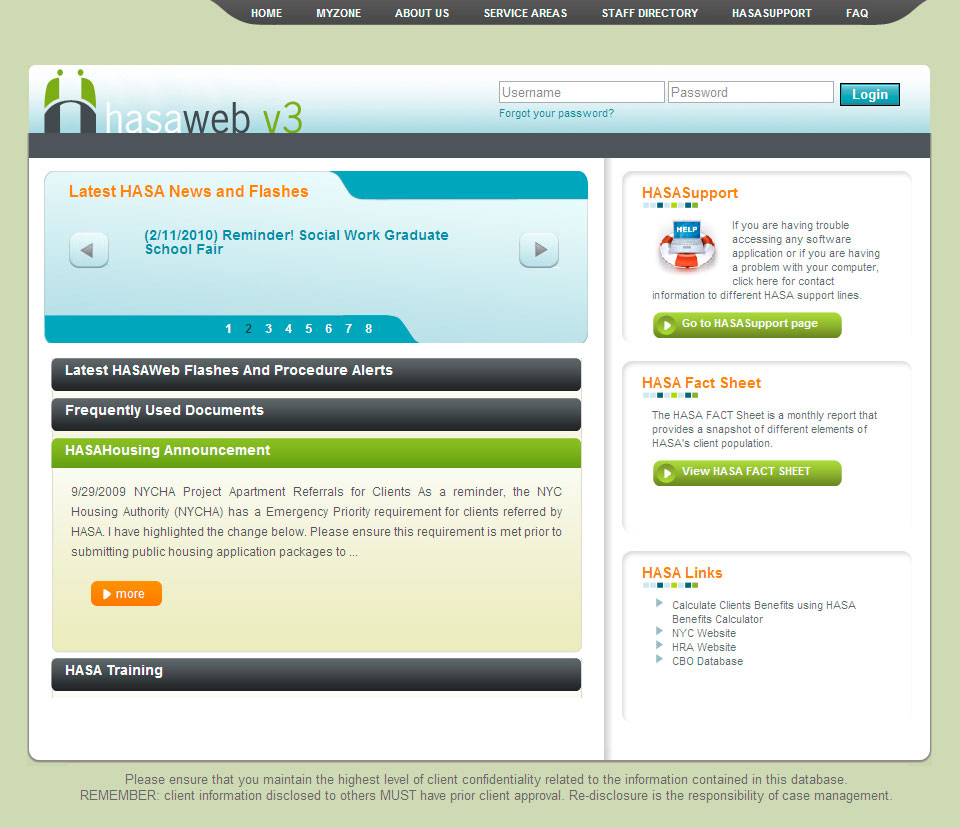
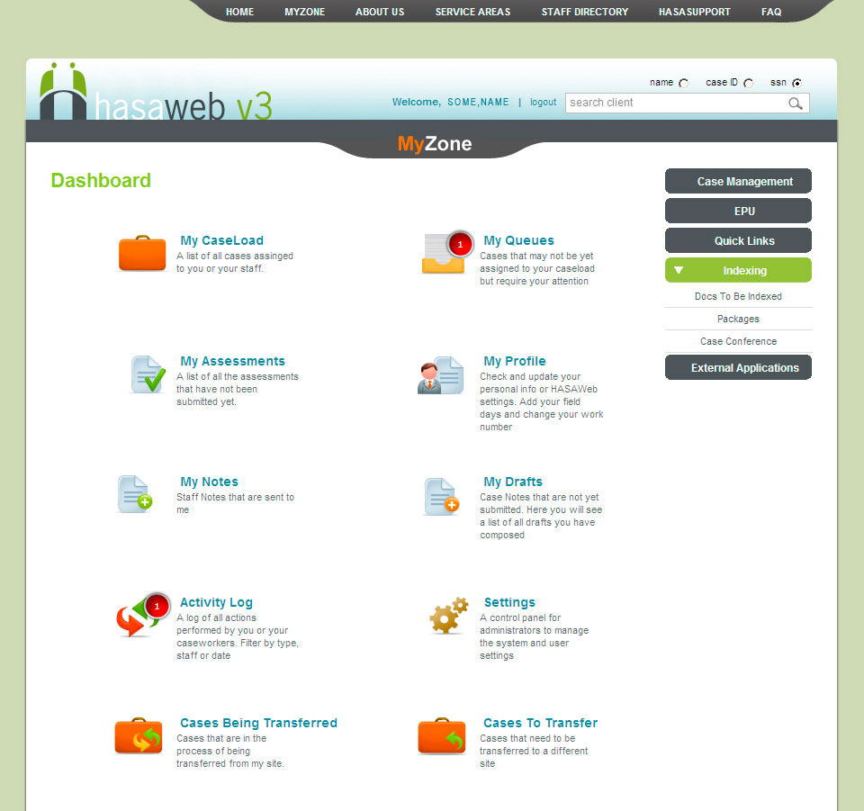
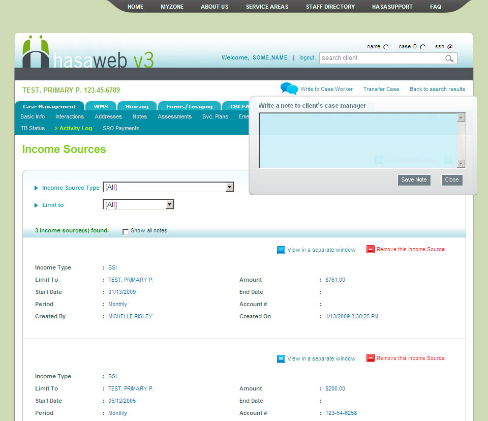
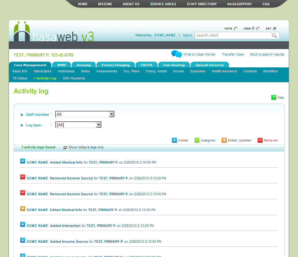
Large scale intranet application for HASA of New York – Hasaweb contains a graphical framework that allows changes and updates to easily occur throughout the site. Progressive enhancement was the key in its design
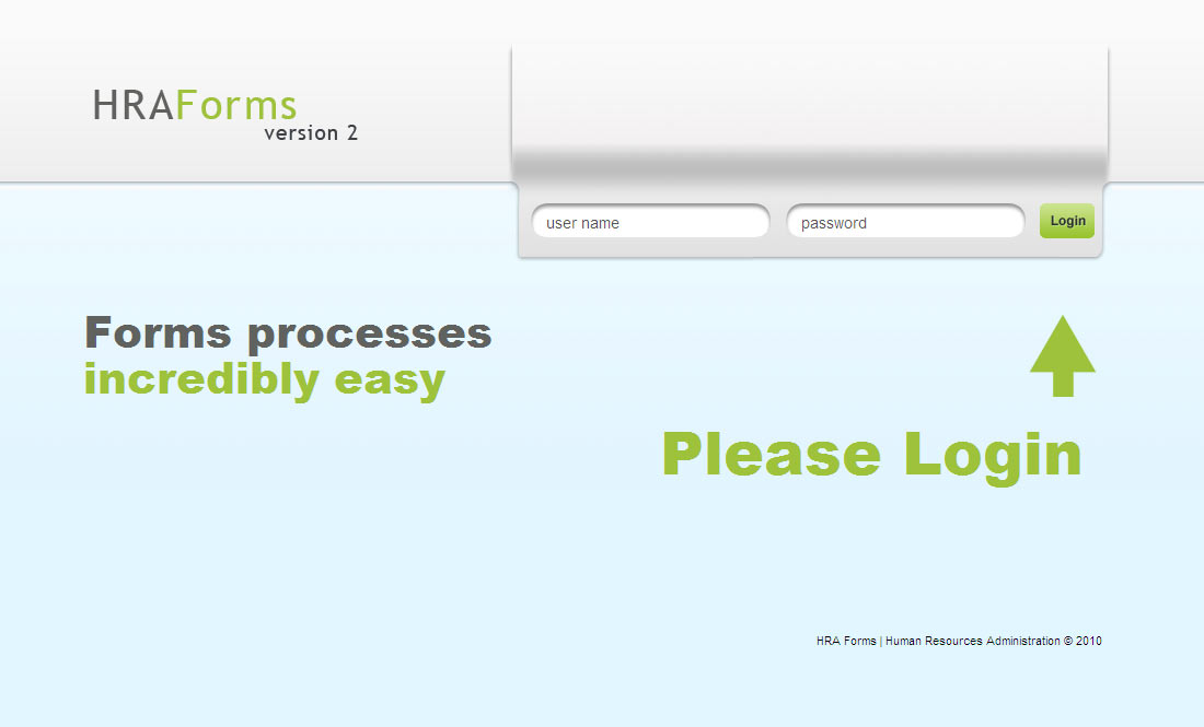
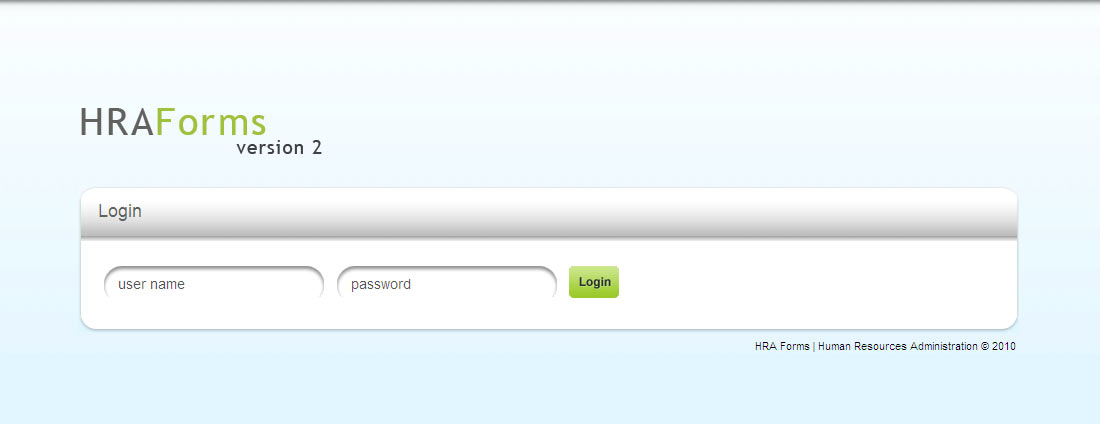
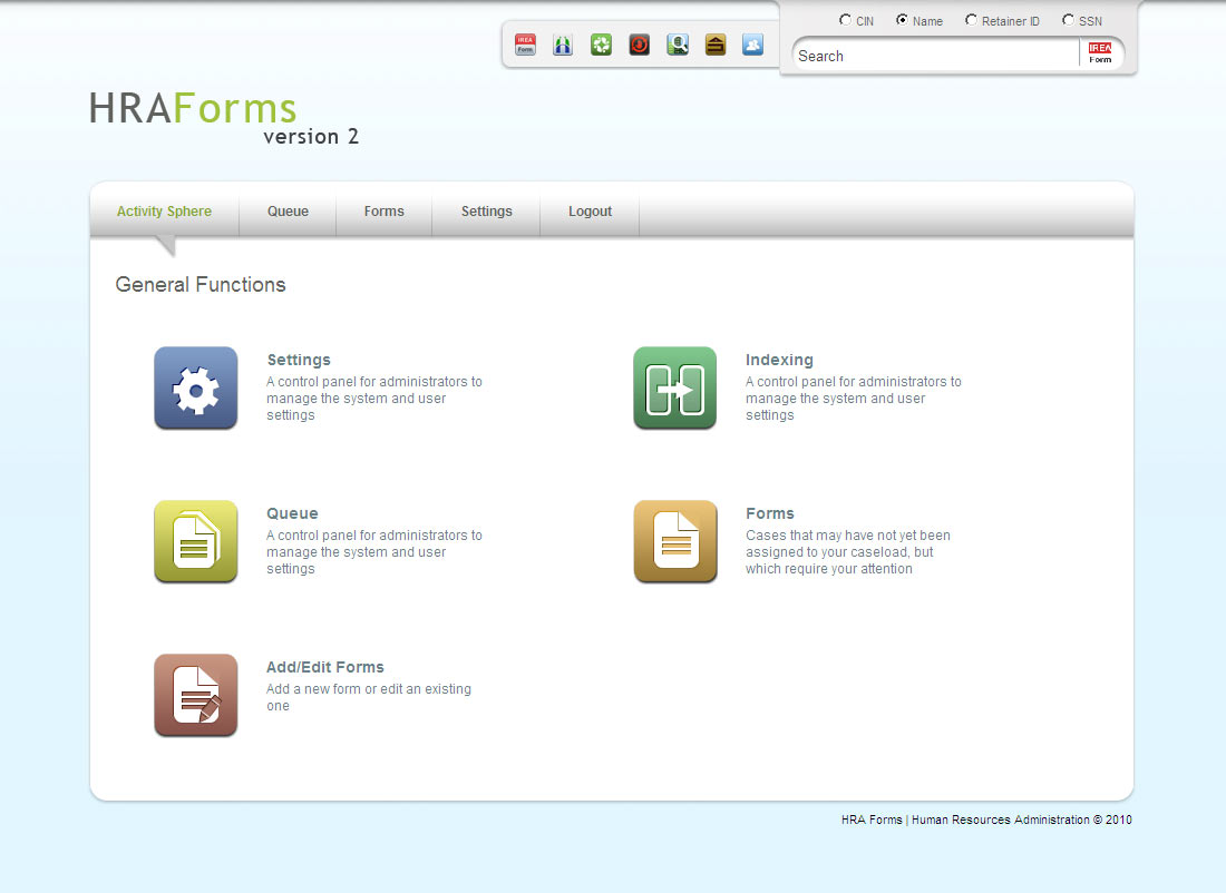
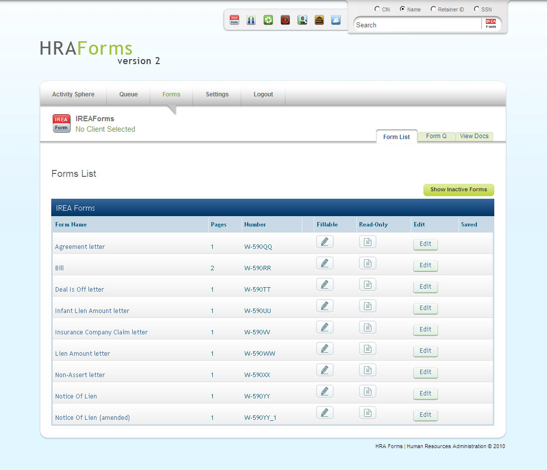
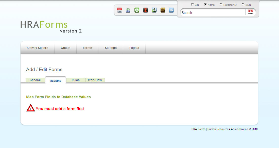
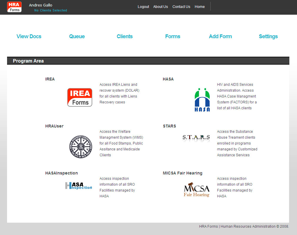
Version 2 of HRA Forms Intranet Application. User Interface and User Experience was redesigned from the ground up to provide great levels of accessibility to all the features added to HRA Forms.
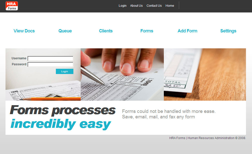
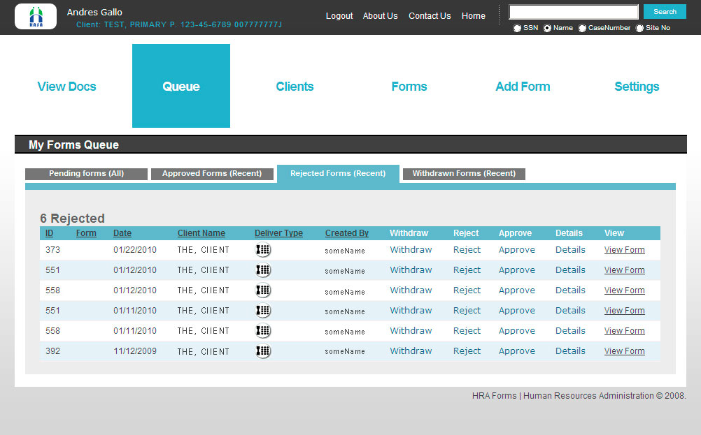
Large scale intranet application for the HRA of New York – Graphic and User Interface design provides an easy to use interface to all the features available in the app
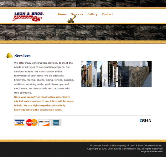
Website design/development, and photography for Leon Brothers Construction Company. This website is clean and structured to display the services in a consice manner.
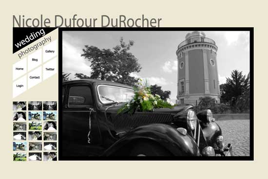
Clean wedding website built on wordpress. The website was developed in such a way to make editing extremely easy. Even the gallery in the homepage is easily edited.Read More
Minimalist design, for legibility and clarity of content. Design on the wordpress platform, the blog allows for very easy to maintain blogging, and content editing.
Branding

This project was a non-profit donation for an organization doing great work mitigating mental illness in Africa, and soon other places. The design was made to be versatile with text, lists, and more. Its meant to allow users to change content with extreme ease while maintaining professional consistency accross the board.º Read more…
Logo design for experimental NYC based rockband “the Lilt.” Logic dictates that if the band is experimental so should be the logo that represents them.º Read more…
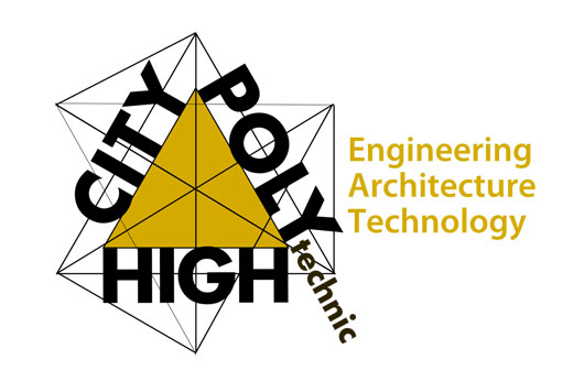
One of the candidates in a competition to become the logo of City Poly High, the logo expresses the technical and mathematical nature of the school’s offerings.
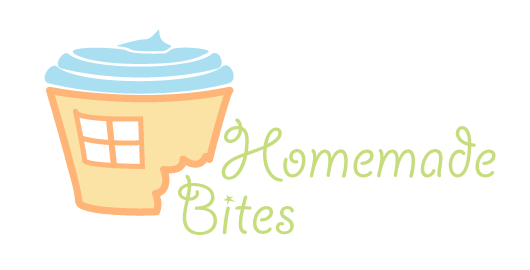
Friendly logo for Homemade Bites. The logo consists of soft edges and pastel colors as well as a metaphor of homemade pastries. Just like the actual pastries the logo is a combination of various flavors working well togetherº Read more…
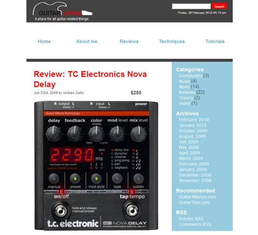
Guitar living logo. The blog takes a minimalistic approach placing importance on clarity and legibility of the content. The logo follows the same idea.
One of the logos selected to become the City University of New York’s CPE branding identity
Illustrative logo for heating ventilation company City Air Inc. Amongst various gray shades, the red and blue tell the story of what the company does.
Print Design
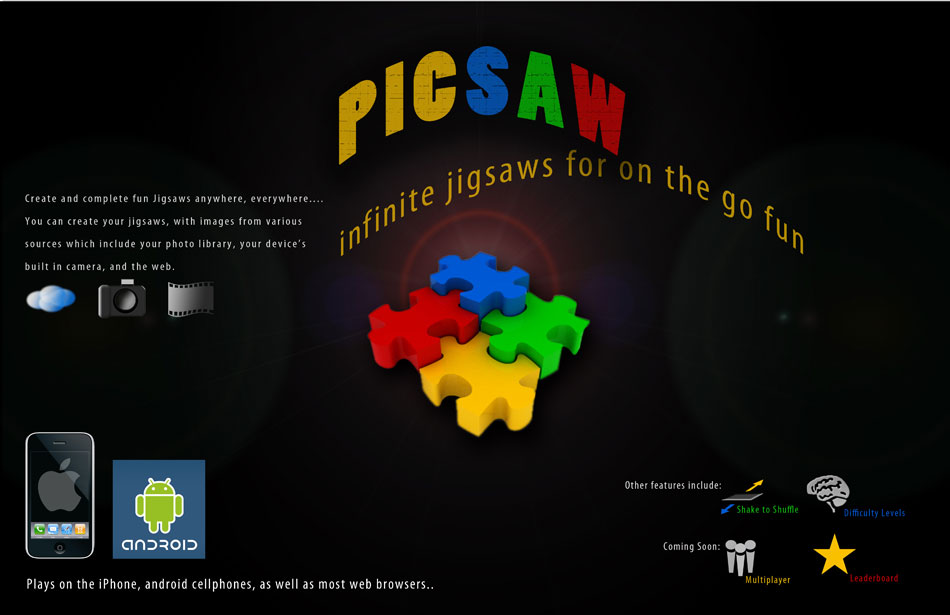
Poster created for the presentation of smartphone appliaction Picsaw. The bright colors speak of the FUN the application represents, while the dark background keeps the overall feel technical for the technical audience viewing the presentation.

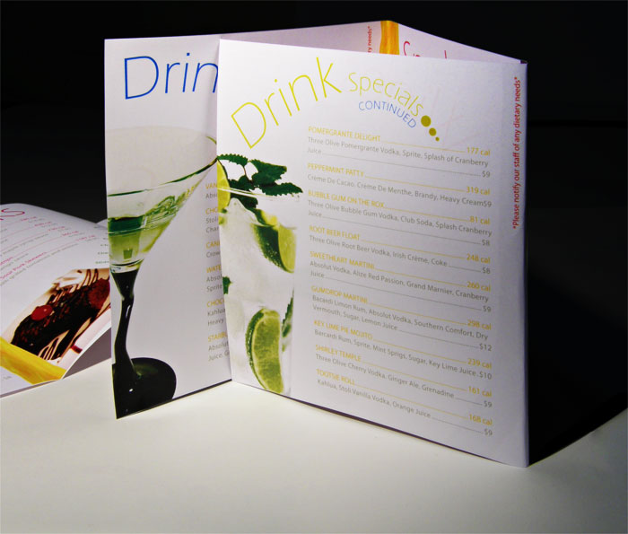
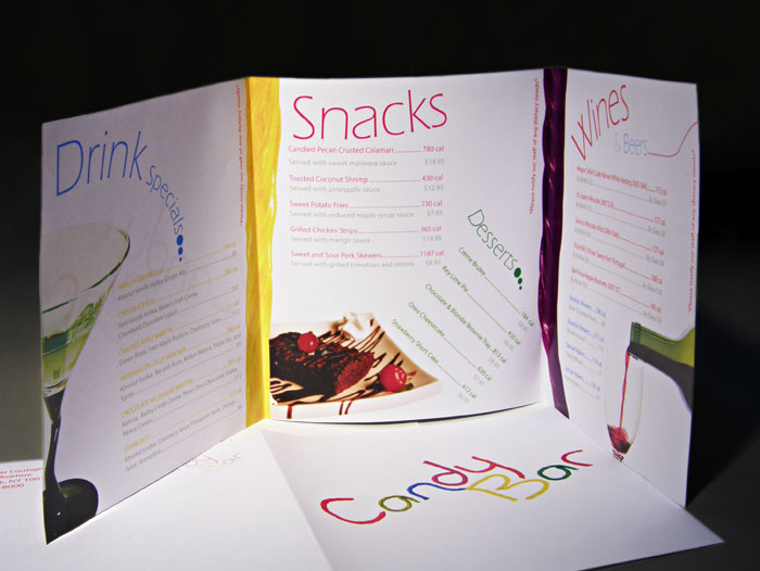
The concept of the candy bar is a bar which celebrates sweets as part of its menu. The typography of the menu interestingly enough is made out of photographed candy which plays well and creates a unique and attractive menu.º Read more…
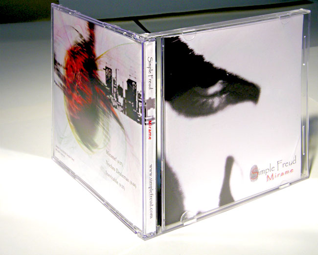
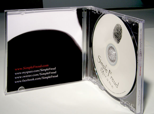
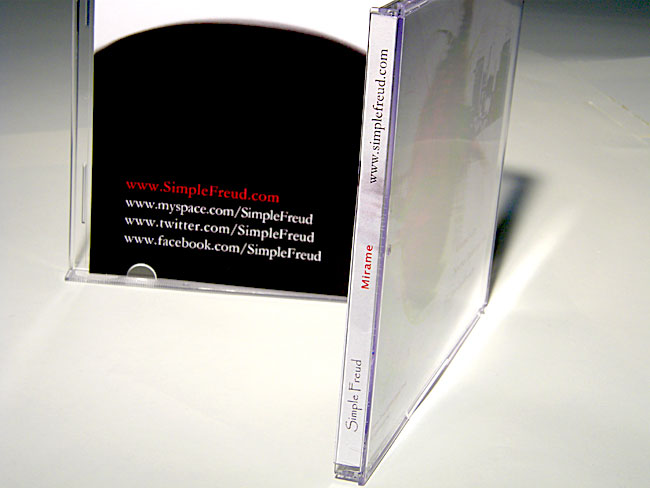
Simple Freud is a NYC based spanish Rock Band with an elegant mix of sounds from various genres, as well as a punch of attitude. Their album art share the same ideas merging minimalism and grunge styles all at once.
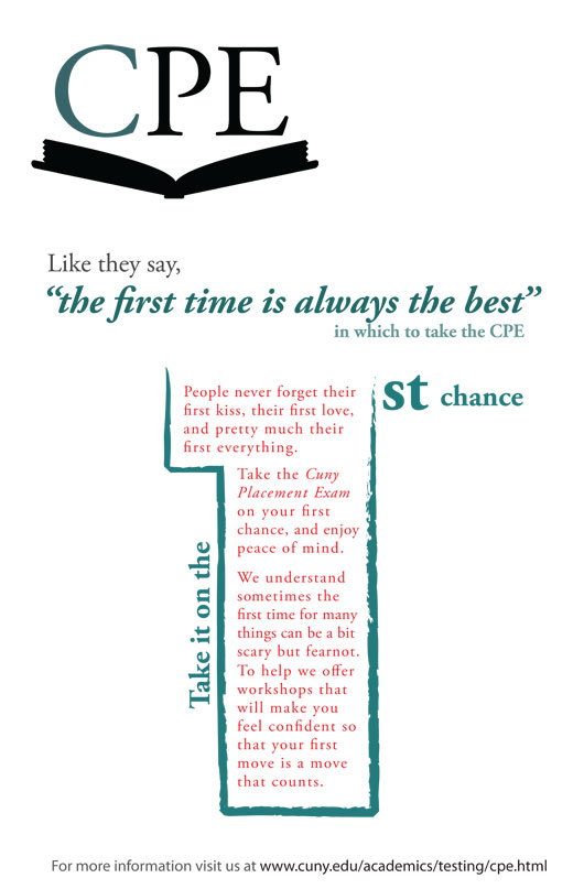
A good example of a good time in which to take risks. This poster is aimed at college students taking the CPE. Its goal is to encourage students to take the CPE on their first change for the sake of peace of mind. Being a college student is usually associated with all sorts of topics, one of which I riskfully used in this poster to attract college readers.
Share this:


Sorry, the comment form is closed at this time.