As many of you may know I always like to deconstruct my creative and development processes in writing. I usually write about projects which place an emphasis in branding, and pure design, but here I will write with emphasis on information architecture, and the overall creativity in the use of data rather than graphics.
Unlike the other projects I tend to talk about in my blog, this project was done for a course I took in “information architecture.” The goal of the project was simple: we were given dozens of words related to information and the web, and were asked to create an effective medium in which to study using these words. With this being a group project, we quickly began to discuss ideas as to what types of media people could use to study these words. Amongst the plethora of ideas, there was a mention of index cards, quizzes, dictionary, and more. The final medium which consists of a website contains many elements from these ideas.
Before we got to the final result, and once we defined what the project was exactly going to be, we divided ourselves amongst two groups. These two groups were the technical group, which would make sure the project is delivered, and the editorial group which was to make sure that all the information populated in the project is written in a consistent manner.
Originally the project was meant to be simply a static page listing all the terms along with the corresponding definition. This, would have been a perfect answer to what we were looking for, however as the team started working on a google docs spreadsheet, I began to see the possibility of making the website dynamic. Everything on the internet can be interacted with, and so I found no reason for which we should not be able to have code read straight from the google docs spreadsheet. If we can have something read that data, we can have it automatically populate the website with the latest data as the editorial team makes updates to the content. With this idea, I assumed the role of leader of the technical team, and began working on a way to use the google docs spreadsheet as an userfriendly database. It worked!
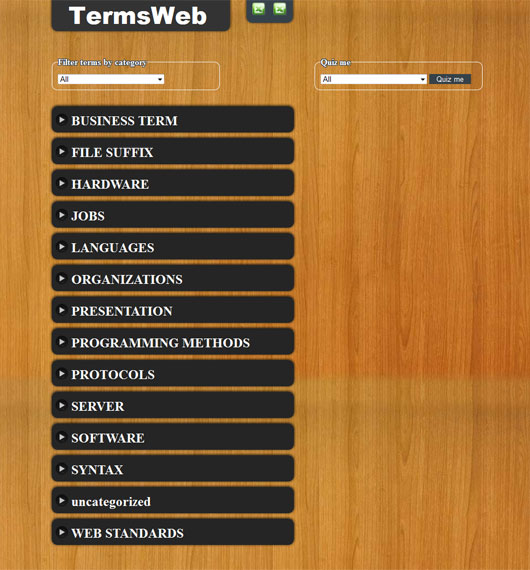
Now that the project had gone from something static to something dynamic, we played with the idea of adding filters and with my teammates decided to create mockups so that we could figure out a simple yet beautiful user interface. My original mockup (pictured below) was used in the final design, but was modified with pieces from the other mockups that could make it even better; a positive characteristic of teamwork giving us a design with the strenghts of all our mockups. Some users found the idea of a wooden background a con, while others liked it. With this in mind, we added a stylesheet switcher to the list of things to implement, furthermore modified the wood appearance to look cleaner (You can see the difference in the mockup below vs our final version). Another modification was to add visual cues for the collapsible list of terms which can be seen in the final design. These visual cues let the user know that the items are clickable.
Below are some of the mockups and a wireframe our instructor, helped us put together so that we could analyze how users would interact with this app.
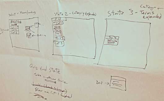
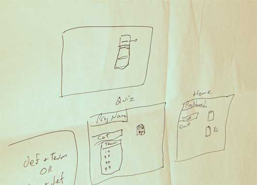
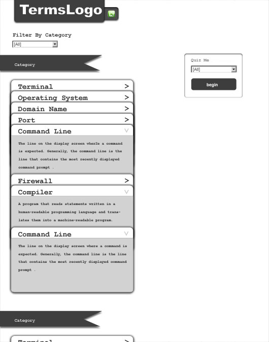
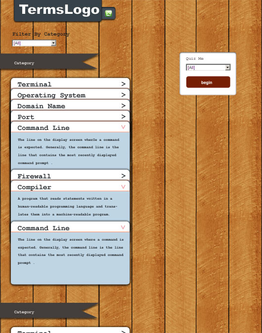
Once we had wireframes and mockups we had a good idea of how the project would look, furthermore as mentioned the google docs spreadsheet was already implemented to work with our website. By this time getting data from the google docs spreadsheet had become easy, and incorporated with a database gave me much room to go script happy. Creating a dictionary or glossary for example, was at this point very easy and could be done in minutes. We still had many days in which to improve this web application and so we decided to add a quiz functionality as well. I wrote this functionality in php, and javascript, after much planning to ensure big performance. At first I thought I could request the quiz questions one at a time, but later found it made no sense to make multiple requests for the sake of performance. Requesting all the questions in one shot, would allow me to not only simulate the “one question at a time” scenario, but would even allow me to have all the questions in one shot like a real paper quiz.
Working on the quiz was really fun. The biggest challenge in the entire project was that of getting a random quiz every time with random wrong answers related to the same category. Making things more complex, the right answers should always show up in a different spot, along the wrong answers. Randomizing was at first the obvious solution, but posed a huge problem. If something is random there is the possibility of getting the same result twice. The solution which took me a while to come up with ended up being really simple. I could just simulate a deck of cards, which is pretty much how the quiz works. One deck of cards is shuffled once PER QUIZ to get all the possible questions. Another deck of cards is shuffled once PER QUESTION with the first 3 cards used for the wrong answers, unless one of them is the same as the right answer. The process is: I get the first the question, and the first right answer from the first deck, shuffle the second deck, and pick out the first 3 answers unless one is the same as the right answer. Then I shuffle the answers to continuously show the answers in a different order every time. The second deck is shuffled every question.
At this point I had thought the quiz to be finished; however there was still something that needed fixing. It was not fun. Without results, there is not reward system for which one would do the quiz. I came up with an idea that would make the quiz more fun. The quiz starts with 50points. Getting all the right answers is equivalent to getting the missing 50 points for a score of 100. More interestingly, you lose points for every wrong answer which makes it fun as there are three wrong answers per question.
This covers most of this fun project. Please check out the project at csv.thelilt.com, and provide some feedback if needed. It can be installed on the ipad and iphone devices so it shows up in the homepage like an app, however it needs to be optimized to use webkit animation rather than javascript on ios devices. To install it as an app in safari, bookmark it, and “add to homepage.” When you open it from the home page it will open without the safari interface, and without the browsers zoom in capability.
If you have any questions or feedback please feel free to write me. I will be more than happy to answer any questions.


Comments RSS and TrackBack Identifier URI ?
4 responsesDo you want to comment?
Trackbacks