Its been a while since my last post, and I have gotten a few people asking me about the candy bar project, so I thought that would be an interesting project to cover. For those of you who have not seen it, candy bar was a concept bar consisting of celebrating sweets as the main part of its menu. A very cool and unique concept requiring a unique concept in the design of its menu, and branding. Branding was not officially part of this project, however, there was no logo so it opened up lots of room to creating an identity with this menu, that could match the concept of the bar. The only restrictions on the design were that the menu should be easy to reproduce in print.
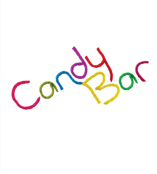
I began sketching, and the idea of using candy for typography hit me. Such an idea could be time consuming, and so I decided to focus my sketching to that concept, but before that, I researched sweets and candy known by everyone which I could use on my design. The result, was to use Twizzlers; this was a candy I could manipulate and photograph to create all sorts of shapes, while still keeping the essence of the shape recognizable as candy. Knowing that it would be easy to manipulate the shape of Twizzlers I felt comfortable sketching all sorts of design ideas, while feeling comfortable that i’d make all of the project deadlines.
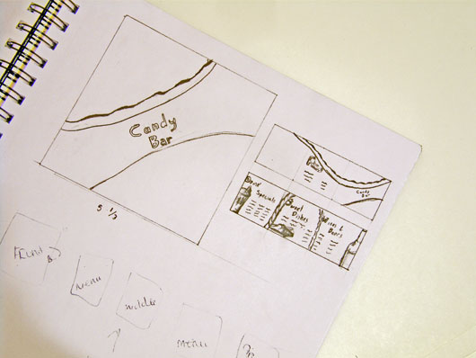
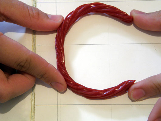
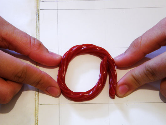
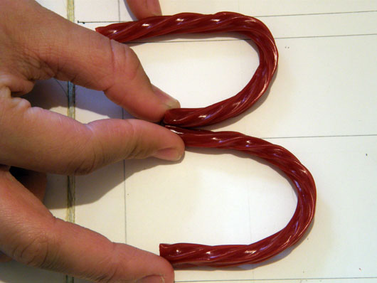
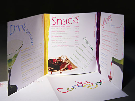
Shown above is one of the sketches which helped me plan the overall structure. At this point, the design was to be a 3 panel brochure, without the usual vertical rectangle shape. From those sketches I planned how I’d have to design each fold-able side so that once printed and folded, the content would come out in the right order. With a foundation ready, the next step would be to create the font, which as mentioned would be made out of physical pieces of candy. I bought a few bags of Twizzlers for the typography, and drew a basic typography diagram in a large white sheet in which I would later place the Twizzlers. The diagram consisted of three horizontal bars to represent the cap-height, x-height, and baseline for the soon to be candy letters. Using the diagram I had someone hold the Twizzlers in the shapes of the letters, while I would photograph the results. This diagram was very important, as it is part of what helped the letters work so well together. You can see some of these photographs below.
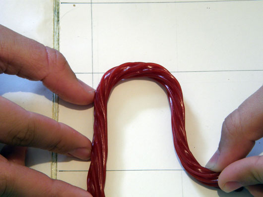
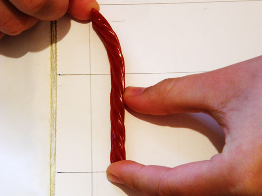
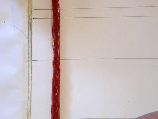
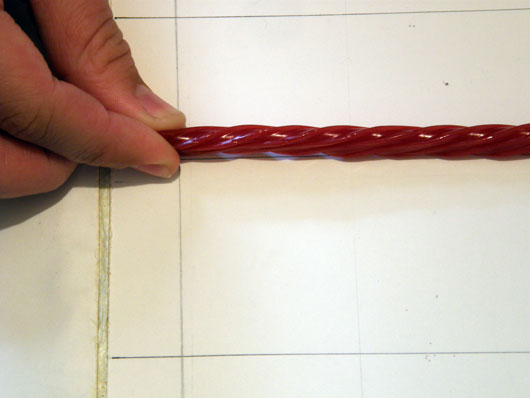
I even took some extra photos of the Twizzlers laying down vertically and horizontally in a straight line, should I need some extra lines out of candy for the design later on. These shots both consisted of the candy shaped as a straight lines. This means perhaps one of these two straight line shaped shots would have been sufficient, however, the lighting is part of the effect that made them require their own image.
At this point had all the shots ready and so began constructing the logo. Although Twizzlers are already candy, I recolored them in all sorts of vibrant colors to integrate the concept with nightlife, and candy of all sorts.
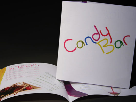
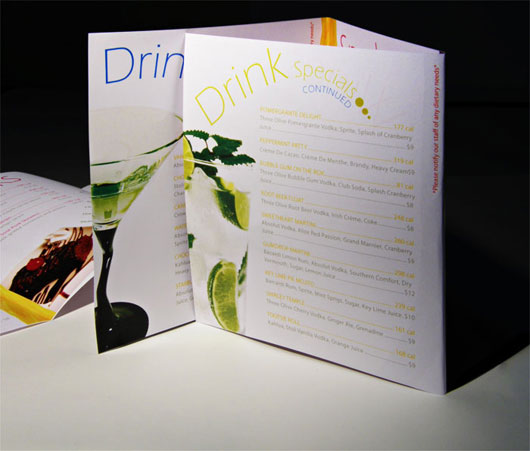
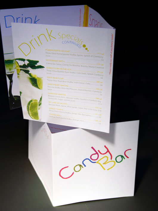
I now had all the pieces together, and therefore began just following the sketches, to bring it together, while making small improvements along the way. The space was limited, and so a lot of work was made to make sure the space is used wisely without sacrificing the clarity of the menu. People should be able to know what they are looking at, as well the prices, and calorie counts of every item. The final result was this.
I hope you enjoyed the read.
Please feel free to write me with any questions or comments. I’d love to hear, or read your feedback.


Trackbacks