The last two months have been very busy reading and learning many new technologies as well as working on lots of cool stuff. Right now it’s a great time for the web with all sorts of cool stuff going on. So just like usual, I would like to share one of my previous projects with all of you.

As you all know, I always like to write about my designs, and don’t think I ever mentioned a non-profit project which I worked on a few months ago. This project was for Global Mental Health Initiatives; an organization which specializes in mitigating mental illness from poor countries. The nature of what they do, requires their website to be very versatile when it comes to text, yet intuitive enough to use as to not require the slightest amount of something as irrelevant as web coding on their end. This is something boring plain text files will do right, however, a website should of course be richer, cleaner, and more expressive all at the same time than any text file. So before even getting started with the website, a content management system would need to be setup, in such a way as to allow easy content editing, while also keeping typography both uniform and dynamic.
To create a solution, I decided to go with CMSMS as the content management system. Just as its name says it is a content management system made simple. Using a simple and versatile CMS, would allow me to setup a tool that would allow me to more fully control how the users add content to the website preventing any inconsistencies that may arise. Using CMSMS, I created a series of typographical elements (CSS classes in reality), to provide the users with some control, while keeping the core of the typography uniform. These typographical elements were structured to look slightly different depending on the module where they show up, to ensure there are some dynamics in the text. All the content manager needs to worry about is filling the textboxes with content. The textboxes work just like the WYSIWYG editors in wordpress, Joomla and many more, but there is one advantage and it’s the reason I chose cmsms. My custom made elements, can be selected from a dropdown, allowing content editors to make decisions based on the semantic names I gave these elements (wrappedAroundImage,subHead,emphasizeMe….) therefore promoting consistency across the website.
I have a love and hate relationship with uniformity however. Too much uniformity can make visuals seem overly plain and dull, and too little of it can make for a messy effect on the wrong hands. So before even starting to design I had a new problem to think about. Fortunatelly, cmsms allows me to setup the content management system so that multiple boxes in a page correspond to multiple areas of the website. This allows me to mimic the modules of Joomla, except it’s a hundred times easier for content editors to manipulate.
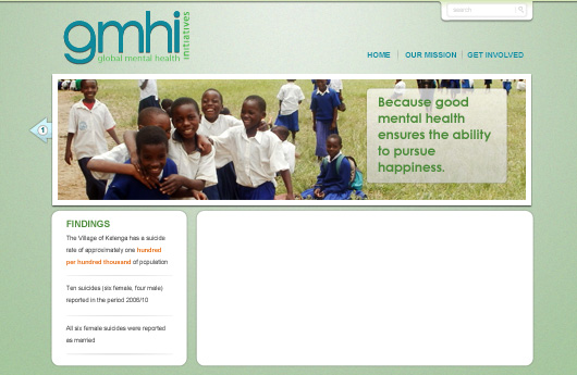
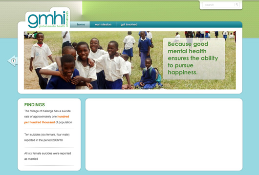
So with the heart of the website setup, the next step would be to design it. Locking the system into generating pretty uniform text, the overall framework or shell of the website needed to look rich and dynamic. I experimented a bit but one thing was for sure, vibrant but friendly colors, and lighting are a must; these characteristics would set the right tone to create an interesting visual welcoming users to read the content. The content should be legible and therefore away from any distractions. Though the image above looks colorful and friendly it needed to reflect the seriousness of the logo.
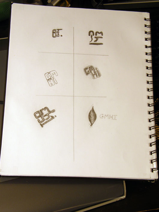
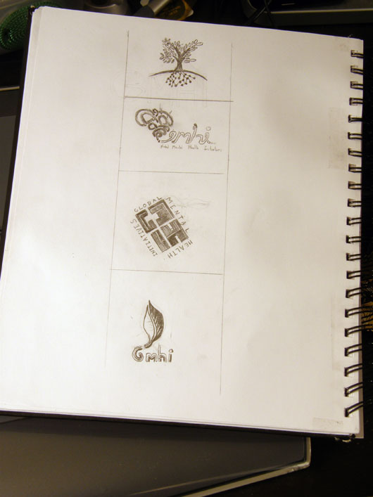

On the logo I tried a few approaches, but ended going for a minimalist and precise direction, just like the website was to become. I felt these would be very defining touches to express the importance of the work gmhi is doing for communities. As an organization it needed to look firm, but also soft around the edges as their aim is after all to help communities. Long story short, the logo as well as the website should show up as both friendly and clear both reasons for going with a logo type. The g was given a roundness to help minimize hard edges, and the i wrong in their typographical heights and design to fit along the rest of the letters in more unity.
And with all said, here is the new design. You can visit their website to see how the content is maintained as it changes.
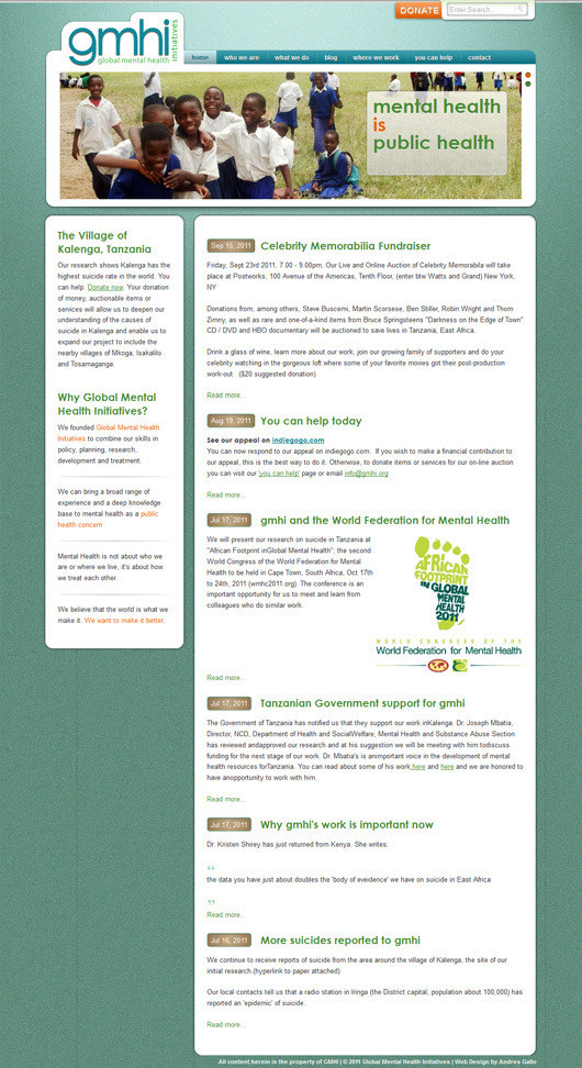
You can visit Global Mental Health Initiative’s website at www.gmhi.org


Trackbacks