Its been a while since my last post, and I have gotten a few people asking me about the candy bar project, so I thought that would be an interesting project to cover. For those of you who have not seen it, candy bar was a concept bar consisting of celebrating sweets as the main part of its menu. A very cool and unique concept requiring a unique concept in the design of its menu, and branding. Branding was not officially part of this project, however, there was no logo so it opened up lots of room to creating an identity with this menu, that could match the concept of the bar. The only restrictions on the design were that the menu should be easy to reproduce in print.
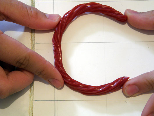
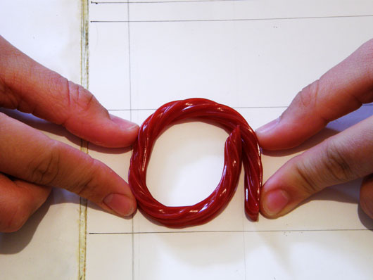
I began sketching, and the idea of using candy for typography hit me. Such an idea could be time consuming, and so I decided to focus my sketching to that concept, but before that, I researched sweets and candy known by everyone which I could use on my design. The result, was to use Twizzlers; this was a candy I could manipulate and photograph to create all sorts of shapes, while still keeping the essence of the shape recognizable as candy. Knowing that it would be easy to manipulate the shape of Twizzlers I felt comfortable sketching all sorts of design ideas, while feeling comfortable that i’d make all of the project deadlines.
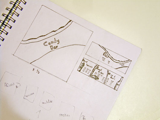
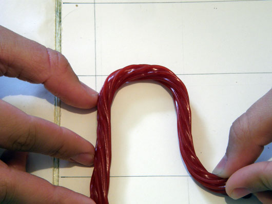
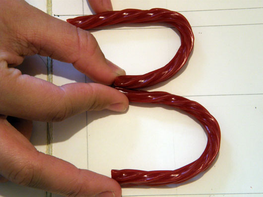
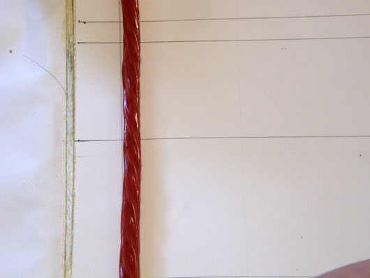
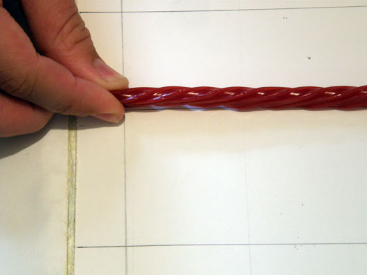
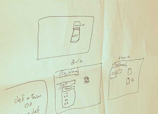
Shown above is one of the sketches which helped me plan the overall structure. At this point, the design was to be a 3 panel brochure, without the usual vertical rectangle shape. From those sketches I planned how I’d have to design each fold-able side so that once printed and folded, the content would come out in the right order. With a foundation ready, the next step would be to create the font, which as mentioned would be made out of physical pieces of candy. I bought a few bags of Twizzlers for the typography, and drew a basic typography diagram in a large white sheet in which I would later place the Twizzlers. The diagram consisted of three horizontal bars to represent the cap-height, x-height, and baseline for the soon to be candy letters. Using the diagram I had someone hold the Twizzlers in the shapes of the letters, while I would photograph the results. This diagram was very important, as it is part of what helped the letters work so well together. You can see some of these photographs below.
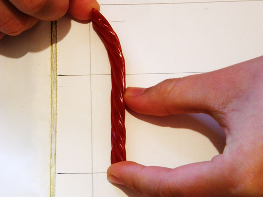
I even took some extra photos of the Twizzlers laying down vertically and horizontally in a straight line, should I need some extra lines out of candy for the design later on. These shots both consisted of the candy shaped as a straight lines. This means perhaps one of these two straight line shaped shots would have been sufficient, however, the lighting is part of the effect that made them require their own image.
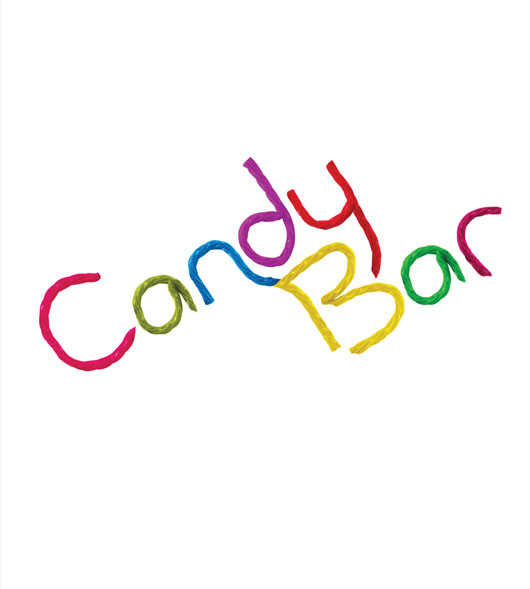
At this point had all the shots ready and so began constructing the logo. Although Twizzlers are already candy, I recolored them in all sorts of vibrant colors to integrate the concept with nightlife, and candy of all sorts.
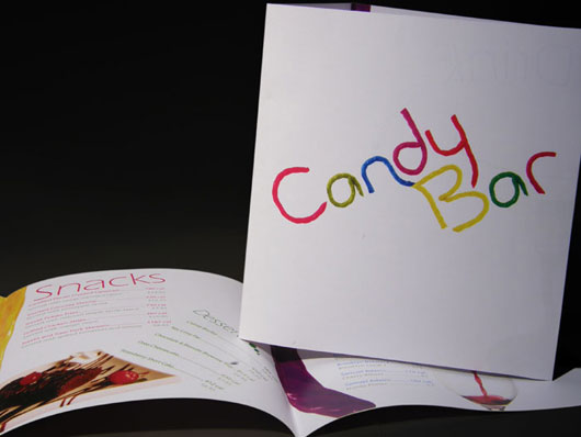
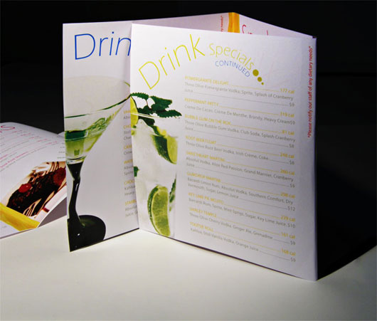
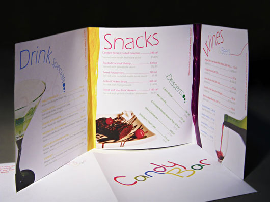
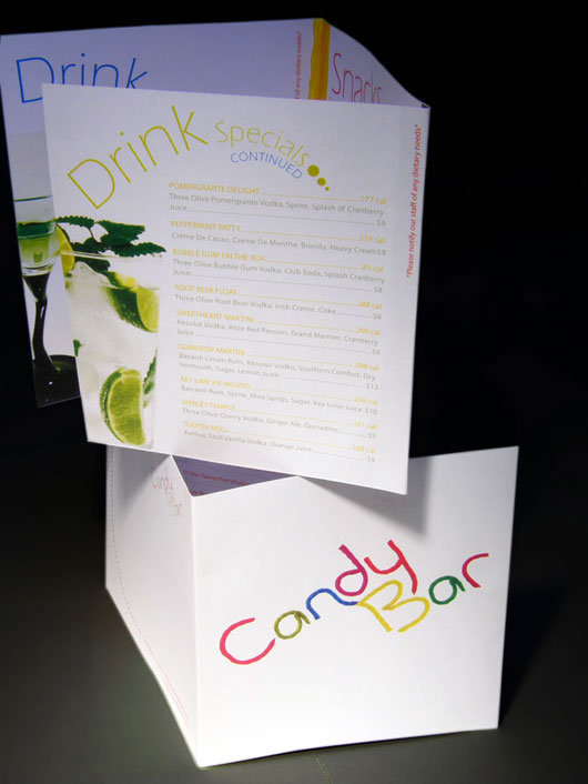
I now had all the pieces together, and therefore began just following the sketches, to bring it together, while making small improvements along the way. The space was limited, and so a lot of work was made to make sure the space is used wisely without sacrificing the clarity of the menu. People should be able to know what they are looking at, as well the prices, and calorie counts of every item. The final result was this.
I hope you enjoyed the read.
Please feel free to write me with any questions or comments. I’d love to hear, or read your feedback.
As many of you may know I always like to deconstruct my creative and development processes in writing. I usually write about projects which place an emphasis in branding, and pure design, but here I will write with emphasis on information architecture, and the overall creativity in the use of data rather than graphics.
Unlike the other projects I tend to talk about in my blog, this project was done for a course I took in “information architecture.” The goal of the project was simple: we were given dozens of words related to information and the web, and were asked to create an effective medium in which to study using these words. With this being a group project, we quickly began to discuss ideas as to what types of media people could use to study these words. Amongst the plethora of ideas, there was a mention of index cards, quizzes, dictionary, and more. The final medium which consists of a website contains many elements from these ideas.
Before we got to the final result, and once we defined what the project was exactly going to be, we divided ourselves amongst two groups. These two groups were the technical group, which would make sure the project is delivered, and the editorial group which was to make sure that all the information populated in the project is written in a consistent manner.
Originally the project was meant to be simply a static page listing all the terms along with the corresponding definition. This, would have been a perfect answer to what we were looking for, however as the team started working on a google docs spreadsheet, I began to see the possibility of making the website dynamic. Everything on the internet can be interacted with, and so I found no reason for which we should not be able to have code read straight from the google docs spreadsheet. If we can have something read that data, we can have it automatically populate the website with the latest data as the editorial team makes updates to the content. With this idea, I assumed the role of leader of the technical team, and began working on a way to use the google docs spreadsheet as an userfriendly database. It worked!
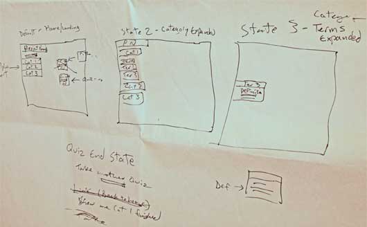
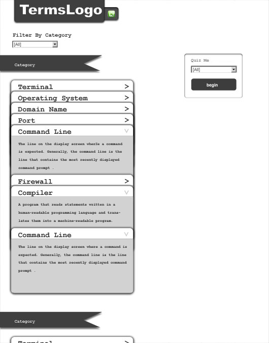
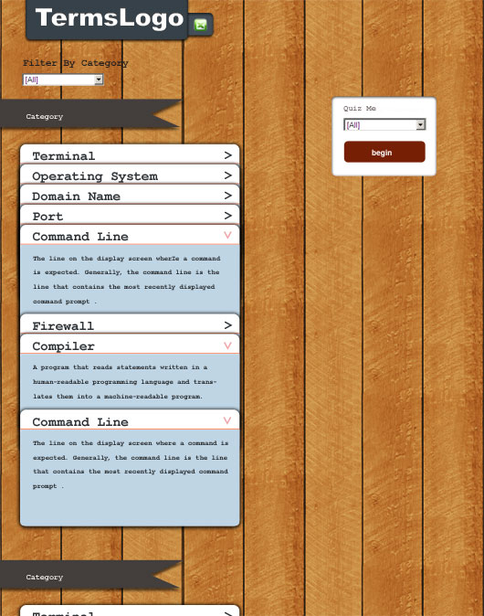
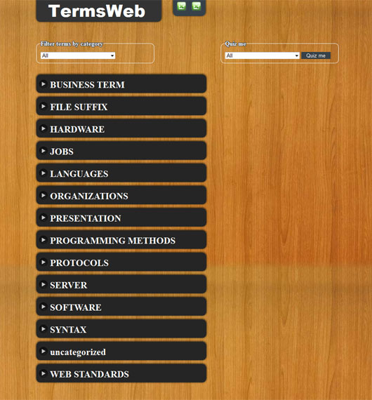
Now that the project had gone from something static to something dynamic, we played with the idea of adding filters and with my teammates decided to create mockups so that we could figure out a simple yet beautiful user interface. My original mockup (pictured below) was used in the final design, but was modified with pieces from the other mockups that could make it even better; a positive characteristic of teamwork giving us a design with the strenghts of all our mockups. Some users found the idea of a wooden background a con, while others liked it. With this in mind, we added a stylesheet switcher to the list of things to implement, furthermore modified the wood appearance to look cleaner (You can see the difference in the mockup below vs our final version). Another modification was to add visual cues for the collapsible list of terms which can be seen in the final design. These visual cues let the user know that the items are clickable.
Below are some of the mockups and a wireframe our instructor, helped us put together so that we could analyze how users would interact with this app.
Once we had wireframes and mockups we had a good idea of how the project would look, furthermore as mentioned the google docs spreadsheet was already implemented to work with our website. By this time getting data from the google docs spreadsheet had become easy, and incorporated with a database gave me much room to go script happy. Creating a dictionary or glossary for example, was at this point very easy and could be done in minutes. We still had many days in which to improve this web application and so we decided to add a quiz functionality as well. I wrote this functionality in php, and javascript, after much planning to ensure big performance. At first I thought I could request the quiz questions one at a time, but later found it made no sense to make multiple requests for the sake of performance. Requesting all the questions in one shot, would allow me to not only simulate the “one question at a time” scenario, but would even allow me to have all the questions in one shot like a real paper quiz.
Working on the quiz was really fun. The biggest challenge in the entire project was that of getting a random quiz every time with random wrong answers related to the same category. Making things more complex, the right answers should always show up in a different spot, along the wrong answers. Randomizing was at first the obvious solution, but posed a huge problem. If something is random there is the possibility of getting the same result twice. The solution which took me a while to come up with ended up being really simple. I could just simulate a deck of cards, which is pretty much how the quiz works. One deck of cards is shuffled once PER QUIZ to get all the possible questions. Another deck of cards is shuffled once PER QUESTION with the first 3 cards used for the wrong answers, unless one of them is the same as the right answer. The process is: I get the first the question, and the first right answer from the first deck, shuffle the second deck, and pick out the first 3 answers unless one is the same as the right answer. Then I shuffle the answers to continuously show the answers in a different order every time. The second deck is shuffled every question.
At this point I had thought the quiz to be finished; however there was still something that needed fixing. It was not fun. Without results, there is not reward system for which one would do the quiz. I came up with an idea that would make the quiz more fun. The quiz starts with 50points. Getting all the right answers is equivalent to getting the missing 50 points for a score of 100. More interestingly, you lose points for every wrong answer which makes it fun as there are three wrong answers per question.
This covers most of this fun project. Please check out the project at csv.thelilt.com, and provide some feedback if needed. It can be installed on the ipad and iphone devices so it shows up in the homepage like an app, however it needs to be optimized to use webkit animation rather than javascript on ios devices. To install it as an app in safari, bookmark it, and “add to homepage.” When you open it from the home page it will open without the safari interface, and without the browsers zoom in capability.
If you have any questions or feedback please feel free to write me. I will be more than happy to answer any questions.
As of late I have been working on a few projects, as well as playing a lot of music which is one of my hobbies (playing guitar to be more specific). I have been thinking a lot about the web, its limitations, and how it is evolving. I hope one day to be able to play music live through the internet, without downloading software like ninjam which suffers from latency due to the limitations of the web. With the way things are moving however, I can see this limitation becoming non-existant soon, however. Along with the web becoming faster there would be a lot more room for new ideas, and types of web applications. With that said, I’d love to hear (or read) what things you’d like to see in the web, which are not possible currently.
I remember a long ago when I had first played with interactivity using flash, and how cool I thought it was to be able to do that. Browsing to an old hard drive I found one of the many conceptual projects I always do for myself to become comfortable with a new technology, or way of thinking. I have tried projects with lots of multimedia, corporate projects with lots of information architecture, ecommerce projects where selling is the priority, and more. I love exploring the possibilities of different technologies, and how these possibilities can help us users. What better way to understand these technologies than to work with them. Long story short, the project I found while browsing on an old hard drive of mines, was a project I did to teach myself some techniques for interactivity and animation which at the time was something new to me.
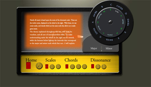
This project which can be found at www.wheel.guitarliving.com consists of a diagram to help musicians study chords and how to build them. The text is mostly filler, but the wheel is the beauty of it. Musicians who understand the chord theory will appreciate the simplicity of the wheel as a learning tool.
This is the first time I show this wheel file. Just thought I’d share it as I thought it was a pretty cool idea especially for musicians. One the meanwhile as usual, I am learning new stuff. Please feel free to share what technologies intrigue you and what you all do about it; I am curious how others react to these changes in technology.
As mentioned in my previous post, I have a deep love for music and as such I am happy to write about another musical website which I had the pleasure of working on. The client this time was Evans Custom Amplifiers (www.evansamps.com); a company well known for making great amplifiers for both steel guitar, jazz, and just about anything that requires really pristine clean sound quality. I had first listened to their amplifiers a few years ago while watching a live show, and so recently I decided to contact them and found their website did not feel of nearly the same great quality that their products possess. With that said, I contacted Scot Buffington, to whom I explained what I could do to improve their website, and with it the impression the website can make in the web.
Their old website was fully functional and did the job, but there were many things asking to be updated and improved. Amongst these things to improve were a better unique design style, brand identity, modern standard practices, improved navigation, and content management features to allow them to maintain the website with ease should they ever want to change the content of a page for example.
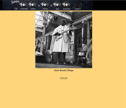
In order to explain the strategies for the design I have included some screenshots of the original design. As you can see in the pictures above, their old design is simple, and has an interesting menu, however, it lacks a good framework to place emphasis on the various elements throughout the website, especially their logo. Their logo is very small, and its actually a really nice logo worth displaying. The kerning and tracking is not exactly even, but it is perhaps that which gives it that recognizable natural appearance. Long story short, that logo deserves to stand out, so that we can try to record it in everyone’s mind. Like the logo, the menu also lacked clarity. Their original menu was very creative which I liked, but could benefit from more clarity in both the resolution of the images, and visual contrast, furthermore could be found confusing to some. With that said, I simplified it the menu while still keeping the context of “amplifier website.” In all of my mockups I made sure to tie the entire design to amplifiers, so people can tell what the website is about in a single view.
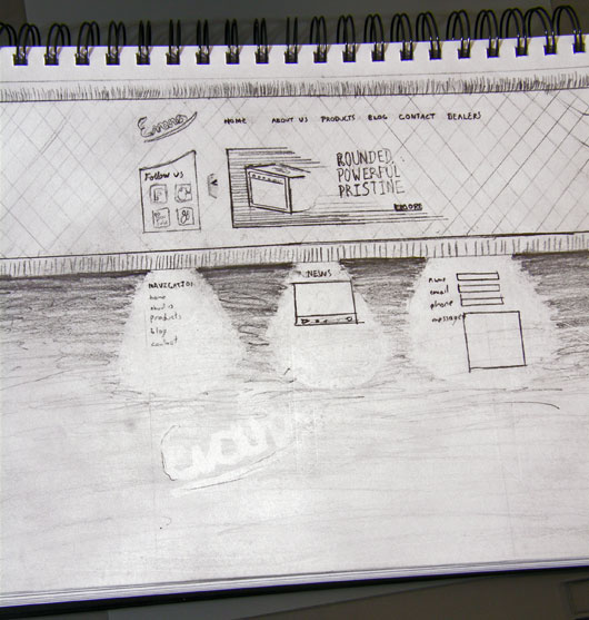
As you can see in the mockups below, there is more emphasis on the products, and the logos stand out more cleanly. Before making mockups however, it is always useful to make a rough map in pencil. Using a pencil allows me to be more free with my ideas, rather than limiting myself to the predefined tools in the computer. The idea is always first.
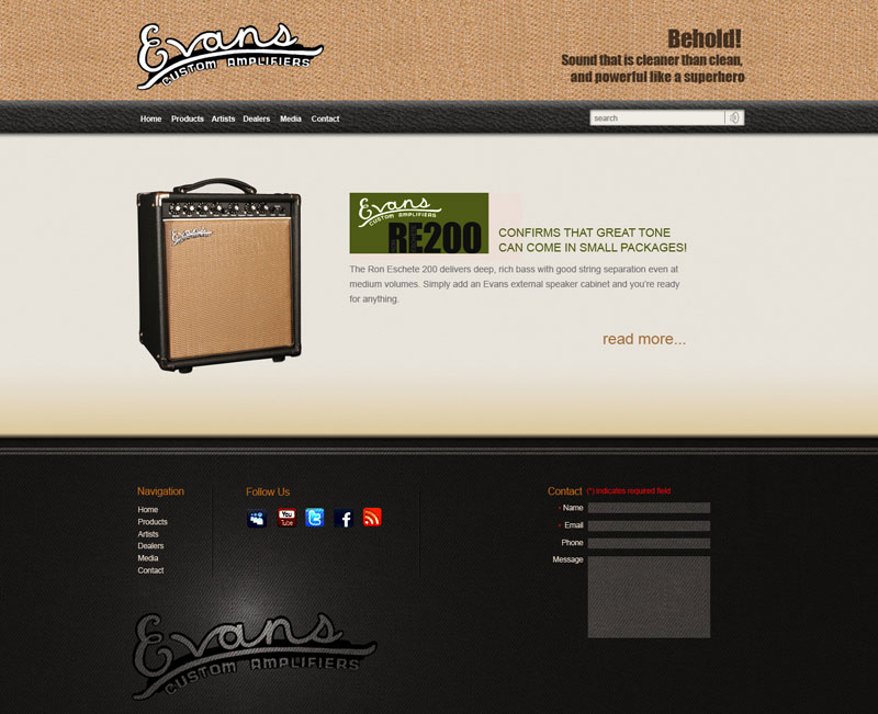
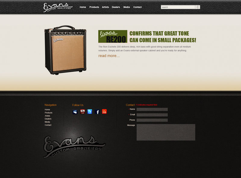
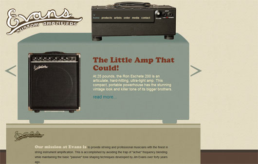
The final version, which is the last image was the one I ended executing as it has the most recognizable appearance which is of great advantage when it comes to brand identity. The look still keeps the vintage warm tones of their amplifier’s sound, and like amplifiers, the layout shares the stacked boxes look of amplification instruments giving a stronger visual cue as to what the website is about. In this layout there are lots of textures to tie into the idea that these amps provide that warm organic sound guitarists love so much. I also asked the client for a photoshoot of their products in very specific angles and lighting conditions. Not only do they make great products, but they were great people to work with. They hired a photographer and had the photoshoot follow my specifications, which was crucial to the execution of the concept. I cut these images providing a very consistent feel across the photographs and product pages. The reason behind the specific angles I requested for this photoshoot are so that users can see all the functions the products have to offer without even reading any technical specifications.
In executing this website I decided to use the HTML5 to make it ready for the future browsers, while ensuring functionality, and design are not compromised in older browsers. The entire website is done around the CMSMS content management system allowing the users to edit the titles, images, content, dealers list, order of products and more. I connected everything to make maintenance of the website a breeze. CMSMS is greatly flexible, and I highly recommend it to everyone who wants to make a truly custom website with its “template withing a template” type work flow.
Visit the final website at www.evansamps.com
I look forward to reading your thoughts on the subject
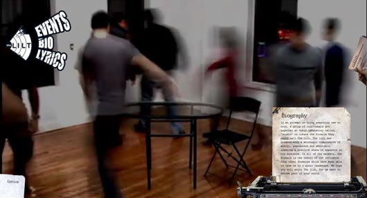
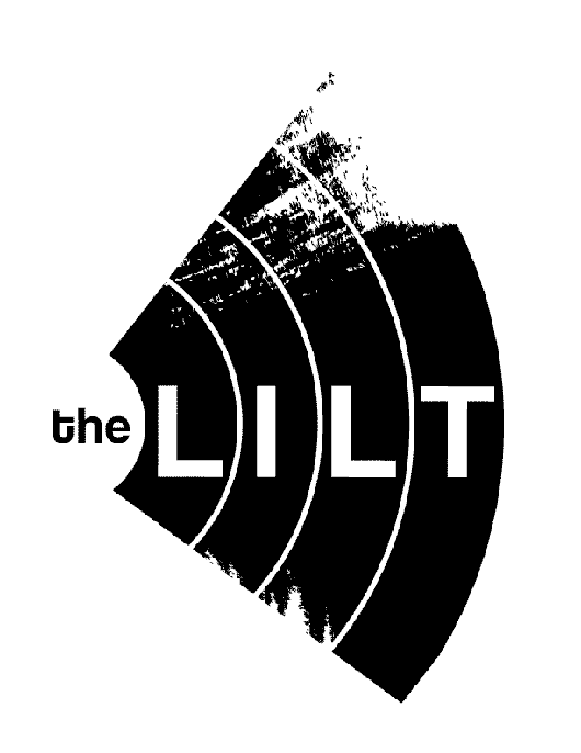
Other than graphic, another thing that is a passion of mines is music, along with the whole world of multimedia. With that said, I decided to play around with HTML5 with the help of some friends of mine as my first take into a “completely different” type of website. Before I got started in this experiment, I was working on a logo, and business card for new New York City rock band, the Lilt. The Lilt’s music, is a strange mix of melancholic, upbeat, and rough melodies which called for a mix of grunginess and cleanliness at the same time. The focus of the experiment was also based around this band. I will be working on their official website in the future, once the material is recorded and ready. On the meanwhile enjoy the experiment website which was a fun project featuring one of the Lilt’s songs.
The experiment can be viewed at www.lilt.andresgallo.com.
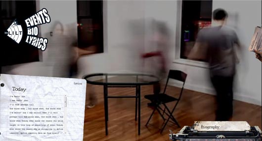
The experiment runs on HTML5, so it requires a modern browser for the best performance. I have optimized it so it works on even IE, although the experience is not the same as it is on a better browser.
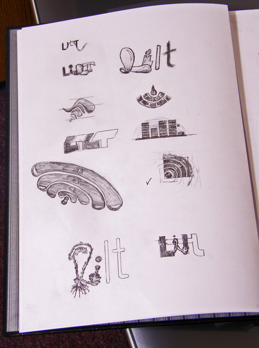
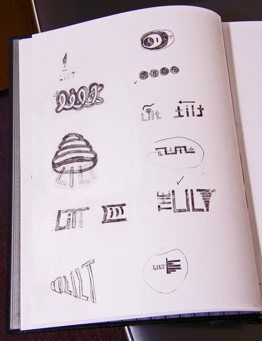
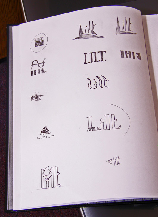
You can see a lot of my workflow as I designed their logo, here. I like to try different things, such as letting my imagination run wild, or mimicking another design and later distorting the original idea to create something unique. As you can see, I like to start with sketches.
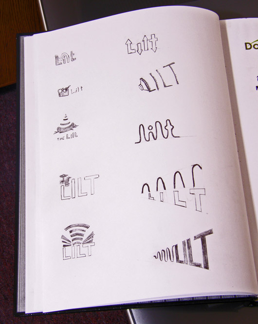
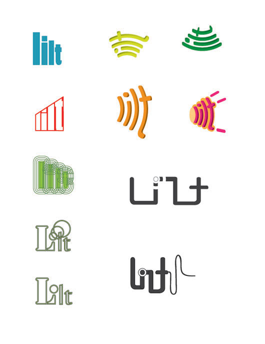
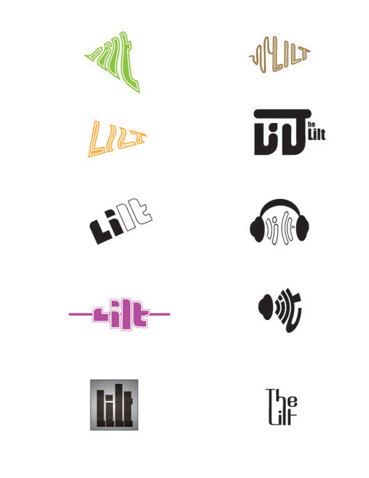
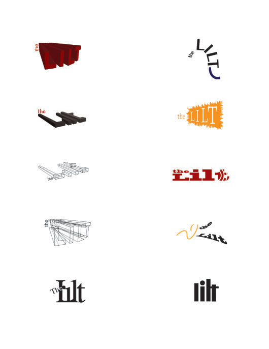
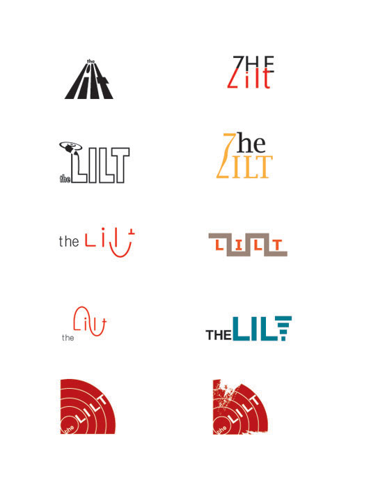
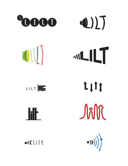
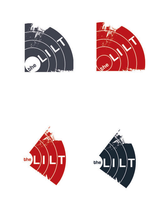
This is the final logo. As you can see, it is a combination of various of my concepts. It has all the rock and roll vibe of the band, with the simplicity that makes it stand out.
Here is their business card, which like the logos was a merge of other concepts.
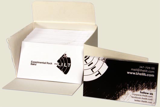
Once again the experiment can be viewed at www.lilt.andresgallo.com.
HTML5 is a wonderful new technology which allows many new possibilities in a web standards context. Working on a paper, about this wonderful technology and its possible effect on the future of the web, I decided to interview Andrew Hoyer.
Andrew Hoyer is a technical and experienced javascript (amongst many other languages) developer, known for various web experiments. I learned about him looking when researching the possibilities of HTML5, and found a really cool and realistic simulation of cloth, in the web.
…And the interview is here
How would you name the position or work you currently do?
I’m currently a Javascript (among other things) Engineer at a startup called Inkling. I work daily to make web-pages rich and dynamic.
What made you choose your field?
For my first two years of University, I was Enrolled in Computational Physics (combination of computer science and numerical physics). This was more or less because I really wasn’t sure what I wanted to do after high school. By the end of my second year I realized that I was enjoying my computer science courses a lot more than my physics, so I just transferred over. As far as getting into Javascript, that happened more or less by accident when I was hired as a web developer for a summer internship.
What things influence you and your work / How do you get ideas on what to do on your work?
Everything influences my work and that is sometimes a bad thing. Because of this I sometimes have trouble focusing on single projects. Ideas are always just popping into my head, but very few actually get implemented.
Who are your favorite web designers/developers?
There are two web developers who I respect immensely. First off is my fellow Javascript engineer Scott Kyle (www.appden.com). He is incredibly talented with any kind of programming, but more importantly he has been an incredible mentor of sorts. Secondly is Ricardo Cabello (www.mrdoob.com). I first found this Cabello via chrome experiments when I submitted my cloth simulation experiment way back at the beginning of January. All of his work, as well as the speed at which he produces his experiments, is absolutely amazing.
What do you feel about this field as to its status and importance in our modern society?
Computer science in general is something that is so deeply ingrained in our society that it is nearly impossible to imagine a world without it. As far as its status, I feel that computer scientist and engineers are generally forgotten about by the vast majority of their users. Either that or there is this stigma that dealing with computers is difficult and that only really smart people can do it… I think this is utterly false. Working with computers, like any other profession, requires effort and patience. Something that I feel is lacking in a lot of individuals (including myself sometimes).
What do you feel is the future of the web?
To me the future of the web is looking incredibly bright. With the constant improvement of web frameworks as well as introduction of new technologies, more and more applications will have no choice but to move into “the cloud”. This is definitely an incredibly exciting time for engineers everywhere.
I really like your work which pushes modern technologies, and would like to know what you think HTML5 will be used for, in the near future?
HTML5 although it is barely in its infancy is incredibly powerful and versatile. This being said it is extremely difficult to predict what it will produce. I guess the only thing that I know html5 will do for sure, is improve the usability of the internet (assuming that users upgrade to a decent web browser). Basically a new era of rich interactive content that does not rely on proprietary software… *cough* getting rid of flash *cough*
Do you feel the future of the web will be a merge of the hard sciences, along with classic development? (I’m basing this on the cloth experiment)
I think the cloth simulation is really just an example of what html5, in particular, and what optimized Javascript and the canvas can do. I do not see it as being any kind of guide as to what might come out in the future. In fact, considering how difficult it was to get the cloth simulation to perform in a decent manner, leaves me hard pressed to believe that html5 will be a source of other numerical projects.
What technologies/ languages do you feel are necessary for a web designer?
The interesting thing about the web is that it is a big mash of so many languages and technologies. I personally believe that a web designer should have a fairly extensive understanding of Javascript (and at least some experience with libraries like jquery and mootools), and of course CSS and HTML. As far as other languages it is really incredibly project dependant, but I would say python, ruby and PHP are all good languages to at least have a basic understanding of.
The cloth experiment… What drove you to work on that?
Again, this was just one of those things that popped into my head one day… sorry, not really all that glamorous.
How do you feel about it? It’s a very popular experiment on the web and one of the things people show when they want to show what HTML5 is capable of.
I am incredibly flattered by its popularity, and in fact would not be where I am today with out it (Inkling found me via the chrome experiments website). At the same time I often feel like a bit of a one hit wonder, in that it has been very difficult to come up with an idea that might “top” the cloth simulation. Regardless of this, I am incredibly happy with the buzz that it has generated for html5 and javascript. I certainly had no intention of this.
Are there any other projects you’d like to talk about?
I’ve always got a million ideas floating around and it’s difficult to try and decide which ones are feasible. That being said, I should fairly shortly have another experiment coming up. I don’t want to say too much about it because there are definitely some things I need to polish and figure out. What I can say is that involves lots of animation, quite a few images and absolutely no code. I’ll send you an email when it goes live.
How do you feel about flash, and what it is doing in the web? Pros? Cons?
As far as flash goes, I feel like it’s an absolutely incredible technology, but is constantly used to abuse users on the internet. I find nothing more aggravating than animated/hidden menus, long loading times and ultimately poor performance (if any) on mobile devices.
As far as I see it the only pro of flash is its complete flexibility for designers and developers, as wells as a huge community of resources (such as tutorials and code samples). This flexibility and ease, however, can also be thought of as a con as it ends up leading to many of the user unfriendly experiences described above.
I feel that flash definitely served a purpose before the introduction of html5. I also feel that html5 will not completely remove the need for flash, but can at least tone down some of the annoyances of the internet as wells as transition developers away from using proprietary and closed technology, to something that is standards compliant and community developed.
Ultimately, flash has done many good things for the internet and has in fact fueled the development of html 5 in some ways. Without it we wouldn’t have some of the coolest websites on the internet (Pandora, Youtube, Vimeo etc).
Is there anything else you’d like to add?
Thanks a bunch for interviewing me. I am routinely amazed at the kindness the cloth simulation has brought my way.
I love cakes especially when they are homemade. One of my recent clients is starting a business doing home made pastries as well as other delicious desserts, furthermore, they have a great name for their business. They are calling their business homemade bites, and they selected me to work on their delicious logo. Their specifications called for a design that is both, cute, and clean. The specification closely reminded me of the cliche 2.0 style, however I its understood that copying trends is a bad brand identity idea. With that said, I made some sketches, in paper first, as I find doing so allows me to think better in terms of concept, furthermore once I’m happy with a concept i’m set to start creating the logo, if not a few logos.
To arrive to concept ideas, I write down keywords, and sometimes I chose to sketch as I think of things. I think most of the ideas in the following image could make a pretty logo, but only a few of the ideas fully captures the essence of the business.
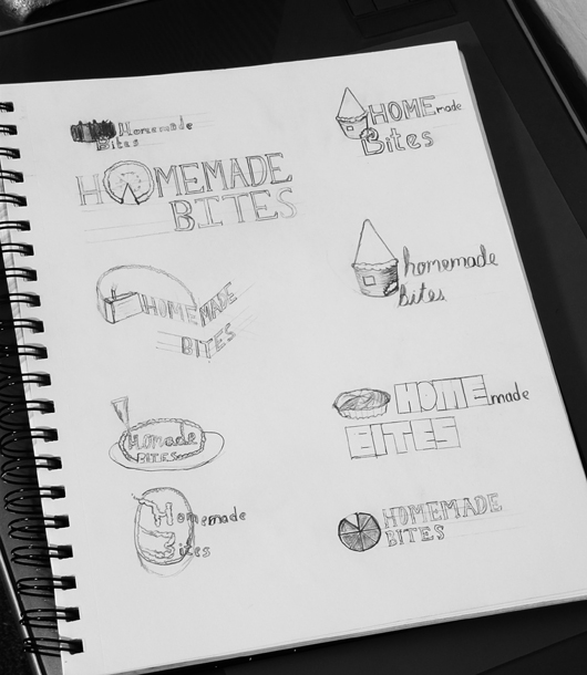
It is important to always take a second look, to see what is just not going to work, and what is. The logos with the pie, are such an example…Homemade Bites does not do pizza, but it almost seems to be the case based on those logos with the pie shape. With that said there were some helpful sketches that led to this final logo.

Next is their web design, which is supposed to be blog based, but needs something special so it is not just another blog.
I have noticed a lot of client-side script blocking lately, which is something of an issue for us web designers and developers. To make matters worse, IE doesn’t fully support the basic pseudo classes, hover, active, and focus making our lives harder than they need to be. Let me now stop complaining about IE, and begin this awesome tutorial which I think is ideal on these dark days of script blocking. Even I myself block scripting from most sites, using nifty firefox addon no-script.
Lets start by creating a small div which will hold the thumbnail. Its nice to use thumbnails for web galleries. For the sake of accessibility, we will use a CSS background image for the thumbnail’s graphic, while we use a real HTML image when the thumbnail is activated, as we want to avoid having two images should the client not support CSS, or have it disabled.
Inside of that div or anchor we then place an IMG tag which holds the larger image. You could even add a caption if you wanted inside a paragraph tag, furthermore we can hide and show the caption using the same technique we will use on the images.
So this leaves us with the structure that is a div/anchor tag which is the thumbnail, and which within it, holds the elements you want to show once its clicked. I advise you use the anchor tag instead of the div, if the content that is inside is nothing but natively inline tags. Anchors have better CSS support for what we are about to do in IE6.
Place all the above structure inside a div that will hold the entire gallery and give this new parent div a class. For the purpose of this demo I will give it the class “Tutorial”
I will also use the anchor tag method rather than the cleaner div method as it works in IE6. If that is not a concern, using divs will be cleaner code.
- HTML Sample
-
1
2
3
4
5
6
7
8
9
10
11
12
13
14
15
16
| <div class="Tutorial">
<a onclick="return=false" class="thumbnailA" href="javascript:void(0)">
<img src="/wp-content/uploads/2010/03/WeddingSketch1.jpg">
</a> <!-- end Image1"-->
<a onclick="return=false" class="thumbnailB" href="javascript:void(0)">
<img src="/wp-content/uploads/2010/03/WeddingSketch2.jpg">
</a> <!-- end CssGallery"-->
</div> <!-- end Image2"--> |
As you can see i added some javascript there as well. If you use an anchor, you want to make sure the browser does not follow the link, otherwise it will go somewhere else or to the top of the page. Using a div instead of the anchor tag prevents this issue, but as mentioned before, it is more limited in IE6 as IE6 supports pseudo classes ONLY on anchor tags.
- The CSS
-
Since the large image is inside of something much smaller, it breaks the laws of physics. Seriously however, what you need to do, is extract it from the thumbnail by positioning it absolute, while the greater Div which we called “Tutorial” is positioned relative to ensure all the images pop up in the same place. Positioning the image absolute is awesome as it looks like its outside of the thumbnail, yet, still allowing us to use nested logic on css.
Once you have figured out where the larger images will show its time to create the CSS responsible for showing and hiding the image. To create this functionality we will be using the pseudo classes hover, active, and focus. IE6 can do hovers to a certain extent, but the newer versions of IE and the other browsers are quiet capable. IE6 is an ignored browser by new web designers, but its a huge market, therefore one which cannot be ignored. We can fix IE6 with javascript, while the modern browsers enjoy an interactive gallery even without it.
1
2
3
4
5
6
7
8
9
10
11
12
13
14
15
16
17
18
19
20
21
22
23
24
25
26
27
28
29
30
31
32
33
34
35
36
37
| div.Tutorial {
position:relative;
/*ensures consistent placement of images*/
/*also set the size of area for gallery here*/}
div .Tutorial a {
display:block;
/*since im using an anchor I need to convert it
to a block type element so I can set the size of
the thumbnail as well as other properties*/
/*widht, height and properties for all thumbnails
should be set here*/
}
div.Tutorial a#ThumbnailA {
background-image:url(Path/Of/ThumbnailA.jpg);
}
div.Tutorial a#ThumbnailB {
background-image:url(Path/Of/ThumbnailB.jpg);
}
div.Tutorial a img {
display:none;
position:absolute;
top:0px;
right:0px;
/*Positioning depends on how you wanna
lay it out of course*/}
div.Tutorial a:hover img,
div.Tutorial a:focus img,
div.Tutorial a:active img {
display:block;
/* you may not need all three pseudo classes
The hover class for example maybe annoying /*} |
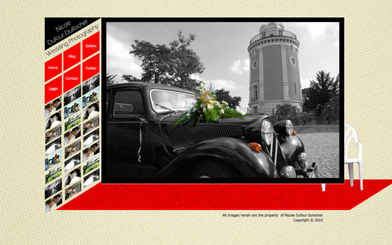
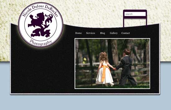
Weddings mark one of the happiest days of the live’s of most people, meanwhile photography, can be used to hold a record of such day in an elegant manner. Assigned to design a layout for a wedding photography company I thought I would keep both things in mind.
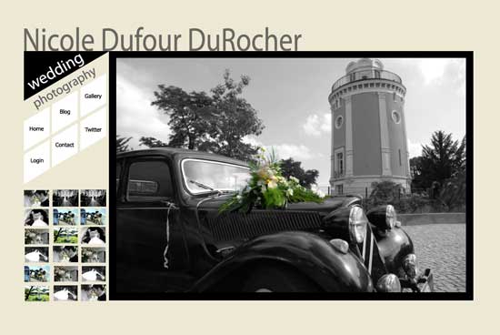
It was a photography site after all that I was supposed to design, and so I began to write down the things that are important for the layout. For one, I did some research on the ratios most cameras output. The web page “photo sizes and image ratios” for example, at http://www.frogprints.co.nz/help/ratio.cfm was of huge help for this, as I want my design to look good regardless of what camera takes the image. Different cameras take their images at different ratios, and it makes no sense to design a great design for a photography site, if the images don’t work with it. Something else which I thought necessary for the site was to design the area for image display as big as possible keeping in mind the standard resolution of 1024×768 pixels. I think it makes sense to have the photos take over most of the screen, as it is good photography the clients will be looking for, furthermore, such a bold decision will show the photographer, as one confident in his/her great skills. I for one would have a hard time hiring someone with a lack of confidence, especially if it’s not someone I know as that well be my first and only impression, which now that I think about it, is the reason why blogs are good.
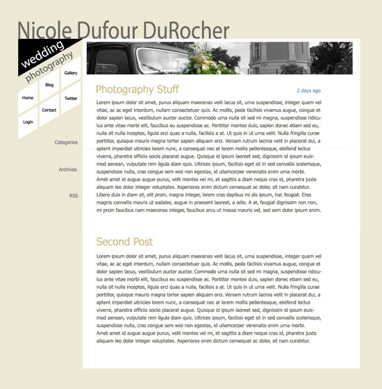
A blog is near necessity nowadays and so it was necessary for me to keep in mind that the design should fit a blog with minor or no adjustments. Blogs allow the web viewers a closer view upon the subject of the site. Most sites I see don’t have a “brand” consistency with their blog, which I thought would be a good thing to have. Not only would it create a greater sense of togetherness, but it would show a much more professional transition between site and blog, emphasizing the brand identity of the photographer. This of course is not just for photography sites, but for just about everything. This makes things a bit more interesting as the design would now need to be able to handle a bold looking photo gallery as well as a clean blog all at once. If one looks around one finds that the layouts for most photo galleries are incredibly different from those of blogs, however no matter the type of site it is always more comfortable to read lots of copy over light backgrounds.
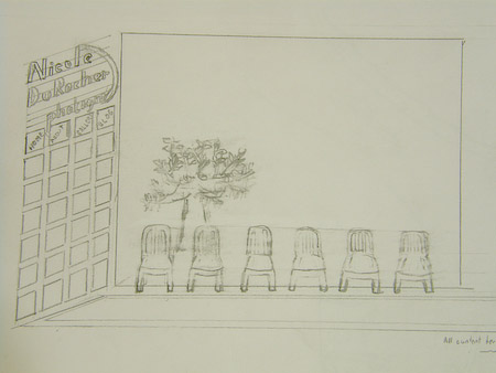
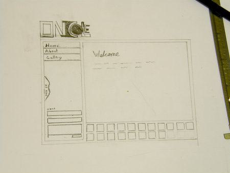
With these clues in mind, I first began sketching on paper some ideas that would allow me emphasize the photos as I desired while keeping the blog text clean. It may seem senseless to sketch on paper to start, but I always have a different mindset when working with paper, which I use as a device for new ideas. My ideas are usually based around more organic less metrically perfect layouts.
Feel free to move your mouse over the following thumnails for a bigger image
These are some of the ideas I came up with sketching on my sketchbook.
Following those sketches and the idea of warmth and elegance associated with matrimony I created these on the computer with a better idea for the color and structure I would use.
I have decided to go with the tonality of the first digital layout, but with a little bit of a stronger background, as shown in the red layout. The beige tone in the layout with the red accents has much more character